How to Choose the Right Website Layout for Your Type of Food Business
Updated:
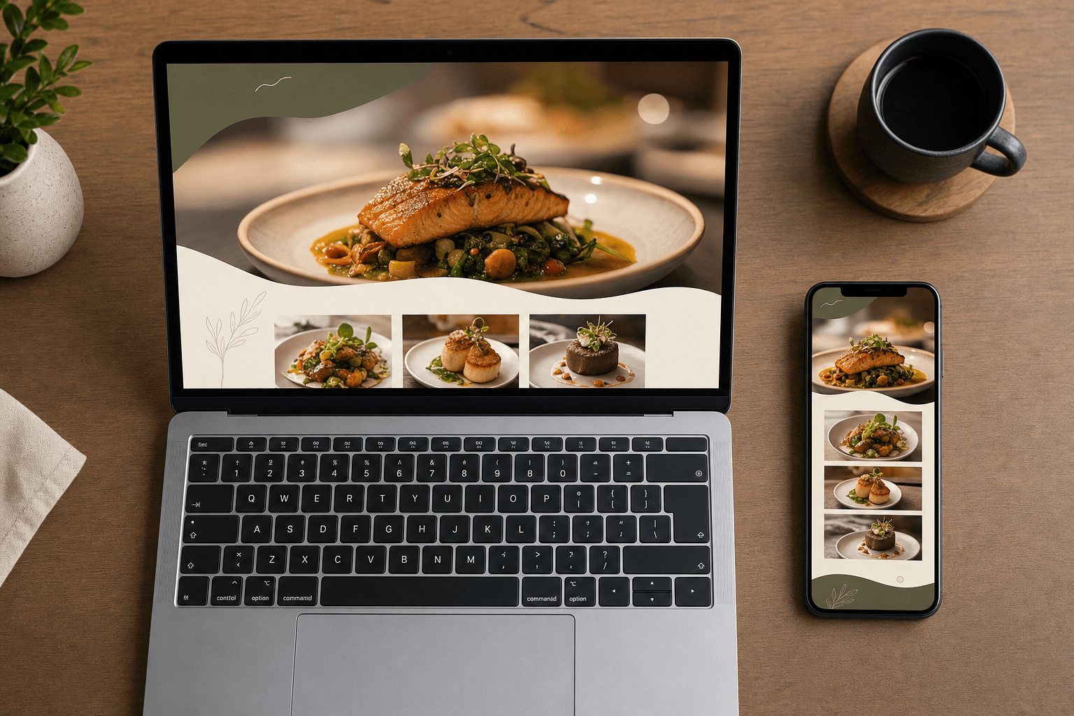
A pizza counter and a fine-dining tasting room both need a website. But they absolutely should not have the same one. The layout, the content hierarchy, the calls to action — all of it should reflect how your business actually works and what your customers need to do before they walk through your door (or place an order online).
Yet most food business owners either copy a generic template without thinking it through, or they overbuild: adding sections, features, and pages that slow down the site and confuse visitors. The result is a website that looks busy but converts nobody.
This guide will help you match your website layout to your specific type of food business — so every section earns its place and every visitor knows exactly what to do next.
Why Layout Matters More Than Aesthetics
A beautiful website that buries your phone number, hides your hours, or makes it hard to find the menu is a bad website. Full stop. Layout is about information architecture — what appears first, what gets the most visual weight, and what action you're guiding the visitor toward.
Customers land on your site with one of a handful of questions:
- What's on the menu and how much does it cost?
- Where are you and when are you open?
- Can I order online?
- Can I make a reservation?
- Is this place right for my occasion?
The right layout answers those questions in the right order for your customers. A fast-casual lunch spot needs to answer "what's on the menu and can I order it now?" within seconds. A fine-dining restaurant needs to answer "is this the right vibe for my anniversary?" before anything else.
Get the layout wrong and you lose the visitor — even if your food is exceptional.
The Fast-Casual and Counter-Service Layout
Fast-casual restaurants, sandwich shops, poke bowls, burritos, and similar counter-service concepts share a common customer behavior: people want to decide what to order before they arrive, or they want to place an order online and pick it up. Speed and clarity are everything.
What to prioritize
- Menu front and center. Your menu — ideally a digital menu that's easy to scan on mobile — should be accessible within one tap from the homepage. Don't bury it under a hero image and three paragraphs about your story.
- Online ordering CTA above the fold. If you offer online ordering, the button needs to be the first thing people see. Make it big, make it obvious.
- Location and hours in the header or sticky bar. Customers are often checking your site while they're already on their way. Don't make them scroll.
- Minimal copy. Short tagline, brief description, done. Nobody reads a 400-word "about us" section before ordering a burrito.
What to skip
Skip reservation systems (you don't take them), long photo galleries, and elaborate brand storytelling sections. Keep the page lean and fast-loading. A single-page layout or a two-page site (home + menu) is often all you need.
The Full-Service Restaurant Layout
Full-service restaurants — whether casual family dining or upscale neighborhood spots — have a more complex customer journey. Guests are evaluating the experience, not just the food. They want to know the atmosphere, the price range, whether they need a reservation, and what kind of occasion the place suits.
What to prioritize
- A strong hero section that communicates atmosphere. Use one excellent photo (or a tight slideshow of two or three) that shows the dining room and the food. This is where the "is this right for us?" question gets answered.
- Reservation CTA high on the page. If you take reservations, this is your primary conversion goal. Put the booking button in the navigation and repeat it in the hero section.
- Menu as a supporting element. Your menu matters, but it's not the first thing a full-service restaurant visitor needs. Link to it clearly, but it doesn't need to dominate the homepage. Use a well-structured restaurant menu page that reflects your brand.
- Social proof. A short block of review quotes or a star rating badge builds confidence, especially for first-time visitors deciding between you and a competitor.
- Private dining or events section. If you host private events, this is a significant revenue stream. Give it a dedicated section or page.
What to skip
Avoid auto-playing video backgrounds (they slow down the site and annoy mobile users), PDF menus that can't be read on a phone, and Flash-era animated elements. Keep the visual language consistent with your in-room experience.
The Cafe and Coffee Shop Layout
Cafes occupy an interesting middle ground. Regulars already know you. New visitors are often discovering you through Google Maps or Instagram and want to know: what's the vibe, what do you serve, and is there somewhere to sit and work? Your website needs to serve both audiences.
What to prioritize
- Atmosphere photography. More than almost any other food business type, cafes sell a feeling. Good interior photos are non-negotiable.
- Menu with drink focus. Coffee shops live and die by their drink menu. Make it prominent, up to date, and mobile-readable. Seasonal specials should be easy to update — a digital menu maker lets you do this without touching code.
- Hours and location, highly visible. Cafe visitors are often impulse visits. Make it effortless to find your address and hours.
- Wi-Fi and seating info. If you have good Wi-Fi and plenty of seating, say so. It's a genuine differentiator for the work-from-cafe crowd.
- Events or community section. Open mics, art nights, pop-ups — if you host events, a small section or a link to an events calendar signals that your cafe is a destination, not just a coffee stop.
What to skip
Skip complex multi-page navigation. Most cafe visitors need only three things: the menu, the location, and the hours. A clean single-page layout with anchor links often outperforms a multi-page site for this business type.
The Bar and Cocktail Lounge Layout
Bars and cocktail lounges have a very different visitor intent than restaurants. People are choosing a venue for a night out — they want to know the vibe, the drink selection, whether there's a cover charge, and what nights have live music or events.
What to prioritize
- Mood-setting hero. Dark, dramatic photography or video that communicates the energy of the space. This is the most important real estate on a bar's website.
- Events calendar, prominently placed. If you have weekly events, DJs, or live music, this drives visits more than anything else. Put it high on the page.
- Drinks menu. A well-designed cocktail menu is a selling tool. Feature your signature drinks with short descriptions. A digital menu that's easy to browse on a phone is far better than a PDF.
- Private hire or bookings. Many bars do significant revenue from private events and buyouts. A dedicated section with a contact form is worth having.
- Social media links. Bars are highly social-media-driven. Make your Instagram prominent — it's often more up-to-date than the website itself.
What to skip
Skip the long "about us" narrative and the food-heavy layout. Unless you're a gastropub with a serious kitchen program, food should be secondary to drinks and atmosphere on a bar's site.
The Food Truck and Pop-Up Layout
Food trucks and pop-ups have a unique challenge: their location and schedule change constantly. Your website layout needs to make dynamic information — where you are, when you're there — the central focus.
What to prioritize
- Schedule or location tracker, above the fold. This is the #1 thing food truck visitors need. Embed a calendar, a map, or a simple text list of upcoming locations. Keep it updated.
- Menu, simple and scannable. Food truck menus are usually short. Display them cleanly and make sure they're mobile-friendly.
- Social media and email sign-up. Since your location changes, you need a way to reach customers proactively. An email list or a strong social following is your primary marketing channel — make it easy to follow you from the website.
- Catering and private events inquiry. This is a major revenue opportunity for food trucks. A simple contact form for catering inquiries should be easy to find.
What to skip
Don't build a complex multi-page site for a food truck. A single, well-organized page that loads fast on mobile is all you need. Complexity is your enemy when your primary visitors are people who just spotted you on Instagram and want to find you tonight.
The Ghost Kitchen and Delivery-Only Layout
Ghost kitchens exist entirely in the digital space. There's no dining room to photograph, no atmosphere to sell. Your website's only job is to drive online orders — either directly or via third-party delivery apps.
What to prioritize
- Order now, immediately. The hero section should be a single-minded push to order. A large CTA button linking to your ordering platform should dominate the page.
- Food photography. Without a physical space to sell, your food photos carry everything. Invest in good photography. Show the actual dishes people will order.
- Delivery zones and estimated times. Customers want to know if you deliver to them and how long it takes. Address this clearly.
- Trust signals. Review quotes, ratings, number of orders completed — anything that builds confidence in a brand that has no physical presence.
What to skip
Skip everything that doesn't serve the order flow. No events section, no reservation system, no elaborate brand story. Every element on the page should either build trust or drive the click to order.
Universal Layout Principles for Every Food Business
Regardless of your business type, a few layout principles apply across the board:
- Mobile-first, always. The majority of your visitors will be on a phone. Design for the small screen first and scale up, not the other way around.
- One primary CTA per page. Decide what you want visitors to do — order, reserve, or find you — and make that one action the dominant call to action. Multiple competing CTAs dilute attention.
- Speed over beauty. A fast, simple site outperforms a slow, gorgeous one every time. Compress your images, minimize scripts, and use a platform that doesn't bloat your page.
- Keep the menu accessible. Whatever your business type, your menu is always in the top three things visitors want. Don't hide it. Use a clean menu template that's easy to read on any device.
- Consistent branding. Your website should feel like an extension of your physical space — same colors, same tone, same personality. Inconsistency erodes trust.
A Quick Layout Decision Framework
Before you build or redesign, answer these three questions:
- What is the single most important action I want a visitor to take? (Order, reserve, visit, follow on social.) Build the layout around that action.
- What question does my customer have when they land on my site? Answer that question within the first screen they see, without scrolling.
- What information changes frequently? (Hours, specials, events, location.) Make sure those sections are easy for you to update without a developer.
If you can answer all three clearly, you have everything you need to make smart layout decisions — regardless of which platform you build on.
Frequently Asked Questions
Do I need a multi-page website or will a single page work?
For most small food businesses — food trucks, cafes, counter-service spots, and delivery-only concepts — a single well-organized page is enough and often better. Multi-page sites make sense when you have genuinely distinct sections with different audiences, like a restaurant that also does large private events or catering.
How important is professional photography for a food business website?
Very important, but it doesn't have to be expensive. A few dozen high-quality shots taken in good natural light with a modern smartphone can outperform mediocre professional photography. The key is showing your actual food and space accurately — not stock photos, and not heavily filtered images that don't match reality.
Should my menu be a PDF or a live digital menu on my website?
A live digital menu is almost always better than a PDF. PDFs are hard to read on mobile, can't be updated without re-uploading, and don't load well on slow connections. A digital menu that lives on a web page is searchable, mobile-friendly, and easy to update in real time — especially useful for daily specials or seasonal changes.
How often should I update my website layout?
The layout itself doesn't need frequent changes — a well-designed layout can serve you for years. What needs regular updating is the content within it: your menu, hours, events, and seasonal promotions. Build your site on a platform that makes content updates easy so you're not dependent on a developer every time something changes.
What's the biggest layout mistake food businesses make?
Burying the menu. It's the most common and most costly mistake. Whether you're a taco truck or a tasting-menu restaurant, your menu is what converts curiosity into a visit or an order. Make it prominent, make it readable on mobile, and make sure it's always up to date.
Ready to build a website layout that actually works for your food business? MenuHoster gives restaurants, cafes, bars, and food trucks everything they need to create a clean, mobile-ready web presence — with a digital menu, online ordering page, and QR code tools built in. Start with a layout designed for your business type and go live in minutes, not weeks.
MenuHoster Team
Helping restaurants go digital