What First-Time Visitors Look for on a Restaurant Website in the First 10 Seconds
Updated:
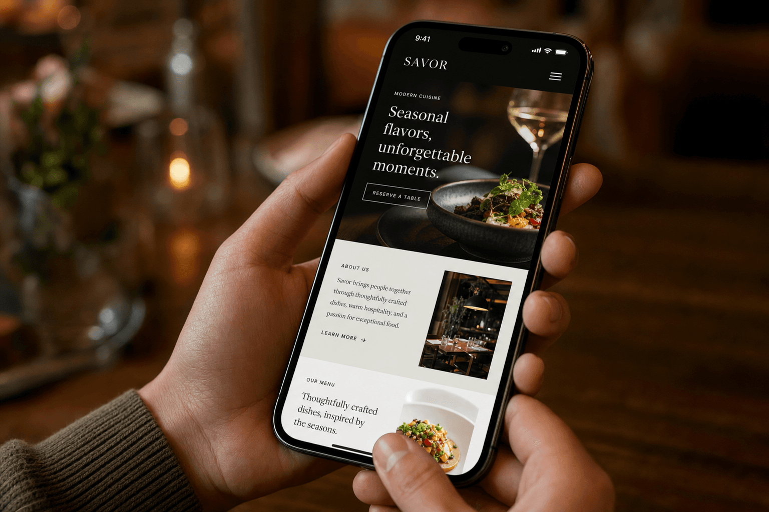
Ten seconds. That's roughly how long a first-time visitor spends scanning your restaurant's website before they decide to stay, dig deeper — or leave and click on the competitor two listings below you in Google. Eye-tracking studies and UX research consistently show that users form a strong first impression of a website within 50 milliseconds, and within 10 seconds they've already made a gut-level judgment about whether a place is worth their time.
For restaurants, cafes, and bars, this isn't just a UX problem — it's a revenue problem. A confused or incomplete homepage means empty tables, missed orders, and customers who drive to a place that made it easier to say yes. This guide breaks down exactly what visitors are looking for in those critical first 10 seconds, and what you can do right now to give it to them.
The 10-Second Mental Checklist Every Visitor Runs
When someone lands on your restaurant website for the first time, they're not reading — they're scanning. They're running through a rapid-fire mental checklist that goes something like this:
- Is this the right place? (Does the name, vibe, and cuisine match what I searched for?)
- Is it open? (Can I go today, or is it worth planning a trip?)
- What's on the menu and what does it cost? (Is this in my budget and does it sound good?)
- Where is it? (Is it actually near me?)
- Do I trust it? (Does it look legitimate and appealing?)
If your homepage answers all five of those questions quickly and clearly, you have a visitor who's converting into a customer. If it answers two or three — or makes them hunt for answers — you're losing people. Let's go through each one.
1. Cuisine Type and Identity — Instantly
The very first thing a visitor needs to confirm is that they've landed in the right place. This sounds obvious, but a surprising number of restaurant websites bury the cuisine type, lead with an abstract tagline, or use a hero image that doesn't communicate food at all.
Your homepage hero section — the first thing visible without scrolling — should communicate your cuisine and concept within two seconds. That means:
- A headline or subheadline that names the cuisine type (e.g., "Authentic Neapolitan Pizza," "Modern Vietnamese Street Food," "Southern BBQ & Craft Beer")
- A hero image or video that shows your actual food or your dining room — not a generic stock photo
- Your restaurant name displayed prominently
Avoid taglines like "Where Every Meal Is a Memory" as your primary headline. They're pleasant, but they tell a first-time visitor nothing useful. Lead with what you are, then layer in personality beneath it.
2. Hours and Open Status — No Hunting Required
After confirming they're in the right place, visitors immediately want to know if you're open right now — or when you will be. This is especially true for mobile users searching for somewhere to eat in the next hour.
Hours should be visible without scrolling on desktop, and reachable within one tap on mobile. The worst pattern is burying hours at the bottom of a Contact page that requires three clicks to find. By the time a visitor gets there, they've already opened a new tab.
Best practices for displaying hours:
- Include hours in the footer of every page so they're always accessible
- Consider a small "Open Now" or "Opens at 5pm" dynamic badge near the top of your homepage if your platform supports it
- If you have seasonal hours or holiday closures, call them out clearly — nothing is more frustrating than driving to a restaurant that closed early
- Keep your hours in sync with your Google Business Profile; inconsistency destroys trust
3. The Menu — The Single Most Important Page on Your Site
Ask any restaurant owner what they think their most important page is, and many will say the homepage or the About page. The data says otherwise. The menu page is almost always the most visited page on a restaurant website, and it's the primary driver of conversion decisions.
First-time visitors want to see your menu fast. They want to know what you serve, roughly what it costs, and whether there's something that sounds good to them. If they can't find the menu within 10 seconds, most of them leave.
Common menu mistakes that kill conversions:
- PDF menus. A PDF requires a download, doesn't render well on mobile, can't be indexed by search engines, and is a nightmare to update. Visitors hate them.
- Menu buried in navigation. Your menu link should be one of the most prominent items in your nav bar — not hidden in a dropdown or labeled something clever like "Eats."
- No prices. Some restaurants omit prices to avoid sticker shock, but this backfires. Visitors who can't see prices assume the worst and leave.
- Outdated menus. A menu that lists items you no longer serve destroys credibility fast.
A digital menu that loads quickly, displays beautifully on mobile, and stays easy to update is one of the highest-leverage investments you can make in your online presence. It's not just a convenience — it's the thing that tips uncertain visitors into committed customers.
If you want to see what a well-structured menu page looks like, browse MenuHoster's restaurant menu templates for examples built around conversion.
4. Location and Directions — Make It Frictionless
Even in the age of Google Maps, visitors expect your website to make it trivially easy to find you. Your address should appear on the homepage — not just the Contact page — and it should be a clickable link that opens Google Maps or Apple Maps directly.
What this looks like in practice:
- Address in the footer, clickable on mobile
- An embedded Google Map on your Contact or Location page
- Neighborhood name in your hero section if your exact address is hard to find ("In the heart of Wicker Park" helps orient visitors before they commit to directions)
- Parking or transit notes if your location is tricky — this is the kind of detail that converts hesitant visitors into confident ones
If you operate multiple locations, make the location selector the very first thing a visitor sees. Don't make them guess which location's hours or menu they're looking at.
5. Trust Signals and Visual Credibility
Within 10 seconds, visitors are also running an unconscious credibility check. Does this place look real? Does it look good? Would I feel comfortable going here?
This is where visual design and social proof do the heavy lifting. A few things that build trust fast:
Real Photography
Nothing signals "this place is worth visiting" faster than high-quality photos of your actual food and space. You don't need a professional photographer for every shot — a modern smartphone in good lighting can produce compelling images. What you absolutely should avoid is using generic stock food photography. Visitors can spot it immediately, and it makes your restaurant feel inauthentic.
Review Snippets
A short pull-quote from a real Google or Yelp review, displayed prominently, adds instant social proof. "Best ramen I've had outside of Tokyo — Google Review" takes up four lines and does enormous trust-building work.
Press Mentions or Awards
If you've been featured in local press, a food blog, or won a local award, a small logo strip ("As featured in...") near the top of your homepage signals legitimacy to first-time visitors who have no prior relationship with your brand.
A Functioning, Professional-Looking Site
Broken links, misaligned text, and a site that looks like it was built in 2009 all register as red flags. Visitors equate the quality of your website with the quality of your food and service — fairly or not. A clean, mobile-responsive site that loads in under three seconds is a baseline requirement, not a bonus.
6. The Call-to-Action Problem Most Restaurants Get Wrong
After a visitor has confirmed you're the right place, you're open, the menu looks good, and you're nearby — what do you want them to do next? Most restaurant websites fail to answer this question with a clear call to action.
Your homepage should have one primary CTA that matches your business model:
- If you take reservations: "Reserve a Table" — prominent, above the fold, linked directly to your booking system
- If you do online ordering: "Order Online" — same treatment
- If you're walk-in only: "View Our Menu" or "Get Directions" are your best CTAs
Don't put three equally-weighted CTAs on your homepage. When everything is a priority, nothing is. Pick the one action that matters most to your business and make it unmissable.
If online ordering is part of your model, your restaurant menu page should make it easy to go from browsing to ordering without leaving the site.
7. Mobile Is Not Optional — It's the Default
More than 60% of restaurant website visits happen on a mobile device, and that number climbs higher when you look specifically at first-time visitors who found you through a Google search. These people are often out in the world, deciding where to eat right now, on a 5-inch screen with one thumb.
If your website isn't optimized for mobile, you are losing more than half your potential customers before they even read a word. Mobile optimization means:
- Text that's readable without pinching and zooming
- Buttons large enough to tap with a thumb
- A menu that loads and scrolls smoothly on a phone
- Phone number displayed as a tap-to-call link
- Page load time under three seconds on a mobile connection
A QR code menu that visitors can pull up instantly on their phone — even before they visit — is one of the best mobile-first experiences you can offer. You can generate a QR code menu that links directly to a fast-loading, mobile-optimized menu page.
8. What to Cut: Things That Slow Down the 10-Second Decision
Knowing what to remove is just as important as knowing what to add. Several common restaurant website elements actively work against fast, confident decision-making:
- Auto-playing video or music. Startles visitors, drains mobile data, and rarely adds enough value to justify the friction.
- Splash pages or age-gate popups. Any screen that exists solely to make visitors click through before they reach your content is a conversion killer.
- Long, scrolling homepage copy. Your homepage is not a blog post. Keep it short, visual, and action-oriented.
- Social media feeds embedded on the homepage. These load slowly, look cluttered, and pull visitors away from your site onto platforms you don't control.
- Outdated specials or events. A "Valentine's Day Special" banner in July signals that nobody is maintaining the site — which makes visitors wonder if the menu is current too.
Putting It All Together: The 10-Second Checklist
Before you next update your restaurant's website, run through this checklist from the perspective of a first-time visitor who knows nothing about you:
- Can I tell what cuisine you serve within 2 seconds of landing on the page?
- Can I find your hours without scrolling or clicking to another page?
- Is your menu one click away from the homepage, mobile-friendly, and up to date?
- Is your address visible and clickable to open a map?
- Do the photos make me want to visit?
- Is there at least one trust signal (reviews, press, awards)?
- Is there a single, clear CTA that tells me what to do next?
- Does everything work smoothly on a phone?
If you can honestly answer yes to all eight, your website is doing its job. If you're hesitating on two or more, those are the gaps costing you customers every day. Building or rebuilding with the right tools makes this easier than it sounds — the MenuHoster online menu maker is designed specifically to give restaurants a fast, professional, mobile-first menu page without requiring a web developer.
Frequently Asked Questions
What is the most important page on a restaurant website?
The menu page. It's consistently the most visited page on restaurant websites and the primary factor in whether a first-time visitor decides to come in or order. Make sure it's easy to find, mobile-friendly, includes prices, and is kept up to date.
Should I use a PDF for my restaurant menu online?
No. PDFs are hard to read on mobile, slow to load, can't be indexed by search engines, and are frustrating to update. A dedicated digital menu page — ideally one that's part of your website rather than a separate download — performs significantly better for both visitors and SEO.
How do I make my restaurant website load faster?
Compress your images before uploading (tools like Squoosh or TinyPNG are free), avoid embedding large video files directly on your homepage, minimize the number of third-party scripts and plugins, and choose a hosting platform optimized for speed. Page load time under three seconds is the target for mobile visitors.
Do I need professional photography for my restaurant website?
Professional photography helps, but it's not strictly required. Smartphone photos taken in natural light during daylight hours can look excellent if the food is plated well and the background is clean. What matters most is that the photos are of your actual food — not stock images — and that they're well-lit and sharp.
How often should I update my restaurant website?
At minimum, update your menu whenever items or prices change, and update your hours any time they shift (including holidays). Beyond that, refreshing photos seasonally and adding new reviews or press mentions every few months keeps the site feeling current. A digital menu platform makes menu updates a matter of minutes rather than hours.
Ready to give first-time visitors exactly what they're looking for? MenuHoster makes it easy to build a fast, mobile-optimized menu page and digital presence — no developer needed, no bloated website builder required. See MenuHoster's plans and pricing and get your restaurant's best first impression live today.
MenuHoster Team
Helping restaurants go digital