How to Organize a Large Menu So Guests Don't Feel Overwhelmed
Updated:
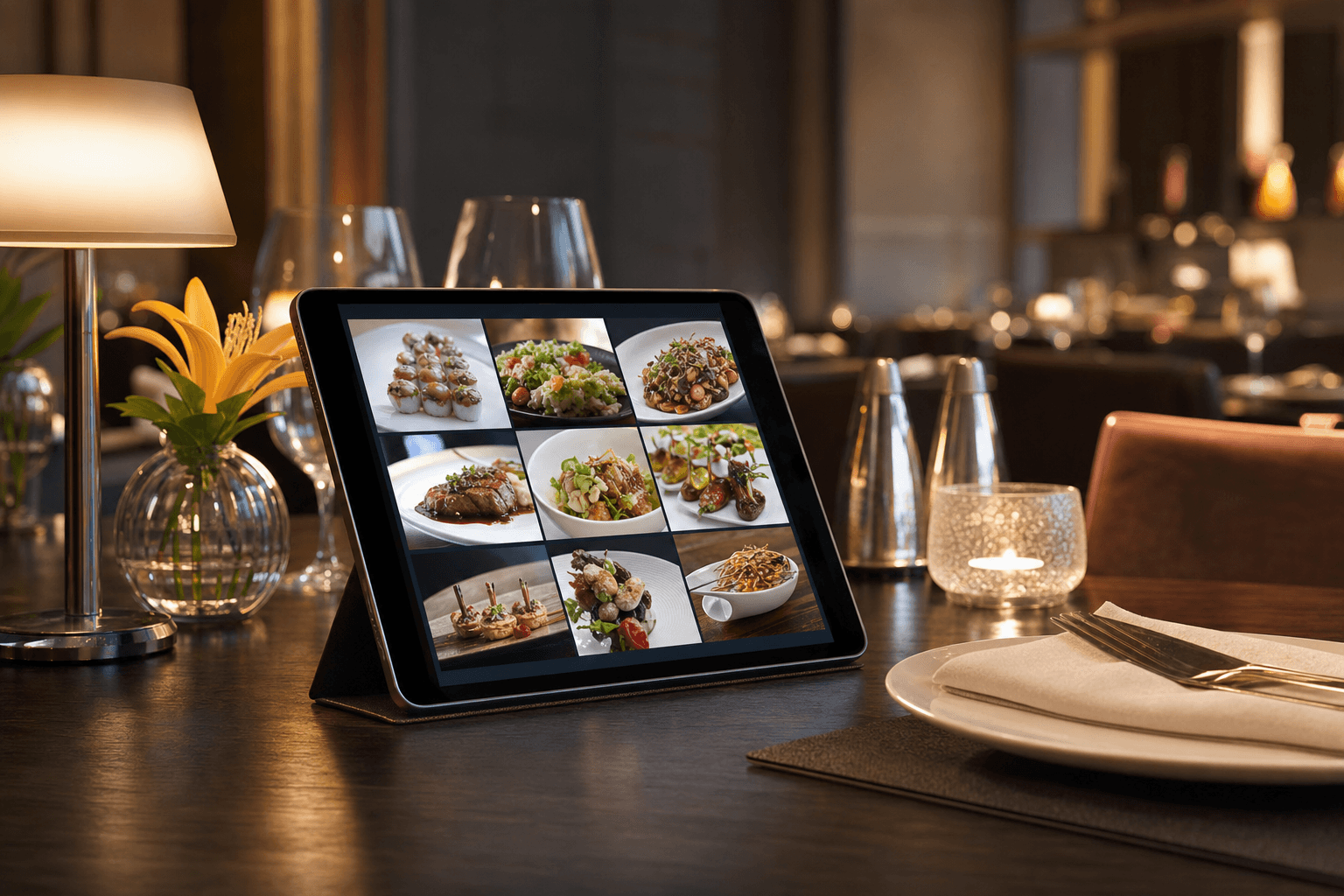
There's a well-known phenomenon in consumer psychology called the paradox of choice: the more options you give people, the harder it becomes for them to decide — and the less satisfied they feel with whatever they pick. For restaurant owners, this isn't just an abstract theory. It plays out at every table, every night. A guest opens a 12-page menu, scans it for 90 seconds without really reading it, then orders the first familiar thing they spot — or worse, feels anxious and takes forever, slowing down your entire service flow.
If your menu has grown over the years — added seasonal specials that never got removed, expanded into new cuisine categories, or ballooned with customization options — this guide is for you. You don't necessarily need to cut your menu in half. You need to organize it so it tells a clear story and guides guests toward confident decisions.
Why Large Menus Hurt You (Even When They Seem Like a Selling Point)
Many operators believe a large menu signals value: "We have something for everyone." In practice, the opposite is often true. Here's what the research and real-world experience consistently show:
- Decision fatigue slows table turns. Guests who can't decide quickly keep tables occupied longer and create bottlenecks during peak hours.
- Kitchen complexity rises. More menu items mean more ingredients to stock, more prep work, and higher food waste — all of which compress your margins.
- Quality perception drops. Diners often assume that a restaurant with 80 items can't possibly do all of them well. A focused, well-organized menu signals confidence and expertise.
- Your best items get buried. If your most profitable, most delicious dishes are competing for attention against 60 other options, they're not doing their job.
The goal isn't always to shrink your menu — it's to present it in a way that feels manageable and intentional. That's entirely achievable with smart structure, even if you keep every item you currently offer.
Start With an Honest Menu Audit
Before you reorganize anything, you need to know what you're working with. Pull your POS data for the last 90 days and answer these questions for every item:
- How often does it sell?
- What's the food cost percentage?
- Does it require unique ingredients that only serve this one dish?
- When did it last get ordered by someone who wasn't a regular?
Items that sell rarely, cost a lot to produce, or rely on single-use ingredients are candidates for removal — not reorganization. Cutting even five to ten low-performers simplifies your kitchen, reduces waste, and makes the remaining menu easier to navigate. This is the single highest-leverage thing you can do before any design work begins.
If you're not sure where to start, take a look at how MenuHoster structures restaurant menus to see how professional menu architecture is typically laid out.
Build a Logical Category Structure
Once you know what's staying, the next job is grouping. Categories are the scaffolding of your menu — they let guests navigate without reading every word. Bad category structure is one of the most common restaurant menu mistakes that quietly cost operators sales.
Follow the meal journey
Organize categories in the order guests naturally eat: starters, soups and salads, mains, sides, desserts, drinks. This mirrors how people think about a meal and reduces cognitive load. Don't get creative with the order unless you have a very compelling reason.
Keep categories tight
A category with more than eight to ten items is usually a sign that it needs to be split or that some items need to be cut. If your "Pasta" section has 14 options, consider breaking it into "Classic Pasta" and "Chef's Pasta Creations," or simply remove the weakest performers.
Name categories clearly
Avoid cute or vague category names that make guests work harder. "From the Garden" is charming but slower to process than "Salads & Vegetables." If you want personality, put it in the item descriptions — not the navigation labels.
Limit total categories
Aim for six to nine top-level categories on a full-service dinner menu. Fewer is usually better. If you're running a café or fast-casual concept, four to six is often plenty. Every category you add is another decision point for the guest before they even get to the items.
Use Visual Hierarchy to Guide the Eye
Layout is not decoration — it's a navigational tool. The way your menu is visually structured tells guests where to look first, what matters most, and where to find what they want. This applies whether you're working with a printed menu or a digital menu.
Use the "golden triangle"
Eye-tracking studies on printed menus show that guests tend to look at the top of the first page, the top right, and the center first. These are prime real estate for your most profitable items. On a digital menu, the top of each category section gets the most attention — put your best items there, not at the bottom.
Limit the use of boxes and callouts
Highlighting every third item with a box or star makes none of them stand out. Reserve visual callouts — badges, icons, shaded boxes — for a maximum of two or three items per category. Use them for genuine bestsellers or high-margin dishes you want to drive.
White space is not wasted space
Cramming items together to fit more on a page makes the whole menu harder to read and creates a sense of chaos. Generous spacing between items, clear section breaks, and readable font sizes all reduce the feeling of overwhelm even if the item count stays the same.
Photos: use them selectively
On digital menus, photos are powerful — but only if they're high quality and used strategically. Adding a photo to every single item creates visual noise. Pick your five to eight signature or highest-margin items and photograph those well. Leave the rest as text. This approach makes the photographed items feel special and speeds up scanning for guests who know what they want.
Write Descriptions That Do Real Work
Item descriptions on a large menu need to be short and functional. This is not the place for a paragraph of prose — guests are scanning, not reading. Each description should answer two questions in one or two sentences: What is it? and Why should I order it?
- Lead with the most distinctive ingredient or preparation method. "Slow-braised short rib with truffle polenta and gremolata" tells you more in six words than "A delicious beef dish served with our house-made sides."
- Flag allergens and dietary info inline. Use small icons or parenthetical labels (GF, V, VG) rather than separate sections. This saves space and helps the guests who need that information find it without interrupting the flow for everyone else.
- Skip filler adjectives. "Fresh," "delicious," "amazing," and "house-made" are so overused they register as noise. If something is genuinely distinctive — local sourcing, a specific farm, a 48-hour preparation — say that specifically.
Group and Surface Your Best Items
One of the most effective tactics for large menus is creating a short "Featured" or "Chef's Picks" section at the top of the menu. This does several things at once:
- It gives indecisive guests a curated shortlist to start from.
- It lets you surface your highest-margin or most distinctive items regardless of where they fall in the main category structure.
- It signals confidence — you're telling guests "these are the things we're proudest of."
Keep this section to four to six items maximum. Any more and it loses its editorial authority. Rotate it seasonally or whenever you want to push a new item. On a digital menu, this is trivial to update — no reprinting required. This connects directly to the broader strategy of using your digital menu as an active sales tool rather than a static list.
Handle Modifiers and Add-Ons Cleanly
Customization options — protein choices, sauce swaps, add-ons — are a major source of menu overwhelm if not handled carefully. A guest who has to read through eight modifier options for every entrée will feel exhausted before they've even ordered a drink.
Separate the base item from its options
Present the core dish clearly and completely first. Then, if modifications are available, list them briefly below the description or surface them only when the item is selected (on a digital menu). Don't let the modifier list visually dominate the item itself.
Limit modifier choices per item
If a dish has more than four or five customization options, consider whether all of them are genuinely necessary or whether you're just trying to please everyone. Fewer, more meaningful choices convert better than an exhaustive list.
Use add-ons to upsell, not to overwhelm
Strategic add-ons — a suggested wine pairing, a side upgrade, an extra protein — can increase your average check without complicating the decision. The key is presenting them as suggestions, not requirements. Learn more about using your digital menu to promote upsells and add-ons without creating friction.
Digital Menus Give You Structural Tools Print Can't
If you're still working from a static PDF or a printed menu, you're fighting the organization problem with one hand tied behind your back. A well-built digital menu gives you structural tools that make large menus dramatically easier to navigate:
- Collapsible sections. Guests can expand only the categories they care about, reducing visual clutter without removing any items.
- Search and filter. Guests can filter by dietary preference (vegetarian, gluten-free) or search for a specific item — no scrolling required.
- Sticky category navigation. A persistent tab bar at the top lets guests jump directly to "Drinks" or "Desserts" without scrolling through everything else.
- Real-time updates. You can hide sold-out items, promote daily specials, and rotate your featured section without any design or printing cost.
If you're ready to move away from a static menu, the MenuHoster online menu maker is built specifically for this — with category management, item filtering, and mobile-optimized layouts that make even a 100-item menu feel navigable.
Test and Iterate
Menu organization isn't a one-time project. Guest behavior changes, your offerings evolve, and what works in spring may not work in fall. Build a habit of reviewing your menu structure every quarter:
- Are there categories guests consistently skip?
- Are servers frequently explaining or recommending the same items — a sign those items aren't surfacing clearly on their own?
- Are there items that sell well in person but rarely get ordered from your digital menu?
Small structural adjustments — moving an item to the top of its category, renaming a section, adding a photo to a high-margin dish — can have measurable effects on order mix and average check. Treat your menu as a living document, not a finished product.
Frequently Asked Questions
How many items should a restaurant menu have?
There's no universal rule, but most menu engineering research suggests that 20–30 items for a focused concept and 40–60 for a full-service restaurant is a manageable range. Beyond that, you're likely carrying items that hurt more than they help. The more important question is whether the items you have are organized clearly — a 70-item menu with excellent structure can feel less overwhelming than a 40-item menu with poor layout.
Should I use photos on my menu?
Yes, but selectively. High-quality photos on four to eight key items outperform photos on every item. Too many photos create visual noise and slow down scanning. On a digital menu, photos also affect load speed — another reason to be selective and make sure any images you use are properly optimized.
How do I organize a menu that covers multiple cuisines or meal occasions?
Use clear top-level categories to separate the occasions (e.g., "Breakfast," "Lunch," "All-Day") or cuisine types, and consider whether separate menu pages or tabs make more sense than one combined list. Digital menus handle this especially well — you can show or hide entire sections based on time of day or day of the week.
What's the best way to highlight profitable items without being obvious about it?
Place high-margin items at the top of their category, use a subtle visual treatment (a small badge or slightly larger type), and write their descriptions with more detail and appetite appeal than surrounding items. Guests respond to these cues naturally without feeling sold to.
Can I reorganize my menu without reprinting everything?
If you're using a digital menu platform, yes — completely. You can restructure categories, reorder items, update descriptions, and change photos in minutes with no printing cost. This is one of the strongest practical arguments for switching from print to digital, especially if your menu changes seasonally or you run frequent specials.
Ready to bring order to your menu? MenuHoster makes it straightforward to build a well-structured, mobile-friendly digital menu that guides guests to the right choices — and makes your best items impossible to miss. See our pricing and get your menu organized today.
MenuHoster Team
Helping restaurants go digital