How to Reduce Order Errors with a Clearer, Better-Structured Menu
Updated:
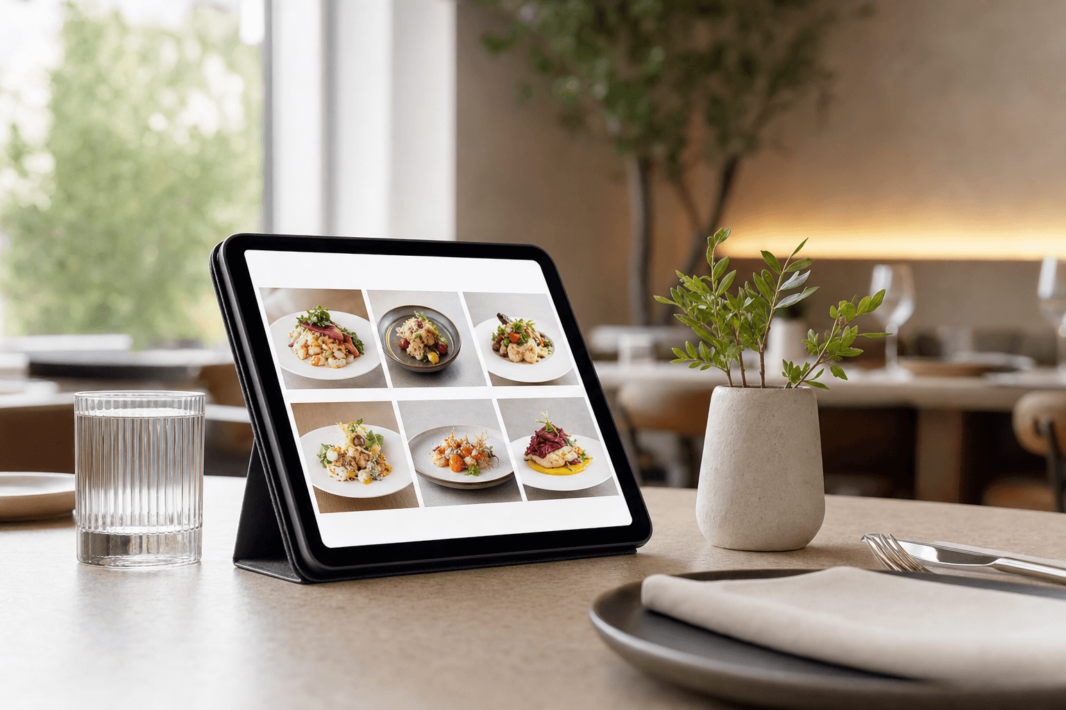
Order errors are expensive. A wrong dish goes back to the kitchen, a new one gets fired, the table waits longer, and the guest leaves with a worse impression than they arrived with. Multiply that across a busy Friday night and the cost in food waste, labor, and lost tips adds up fast.
Most operators focus on fixing errors at the point of delivery — retraining servers, tweaking the POS, adding ticket modifiers. Those things matter, but they treat the symptom. The root cause is often much earlier in the process: the menu itself is confusing. Guests misread items. Servers mishear requests because the guest wasn't sure what they were ordering. Modifiers get assumed rather than asked. A clearer, better-structured menu removes ambiguity before an order is even spoken aloud.
This guide walks through the specific structural and language choices that reduce order errors — and how a digital menu makes those improvements easier to implement and maintain.
Why Menus Cause Order Errors in the First Place
Before fixing the problem, it helps to understand exactly where menus introduce confusion. There are four common failure points:
- Ambiguous item names. "The Classic," "Chef's Special," or "No. 7" tells a guest almost nothing. They order based on a guess, and that guess may not match what arrives.
- Buried modifiers and customization options. If a dish can come with a choice of protein, side, or sauce, but that's not visible until the server asks, guests feel caught off guard and default to whatever sounds familiar — often not what they actually want.
- Inconsistent category logic. When items don't live where guests expect them, they skim past things, misidentify categories, or order something they didn't realize was a full entrée versus a side.
- Missing or vague descriptions. A guest who doesn't know that a dish contains a particular ingredient — or assumes it does — will be surprised at the table. Surprise at the table leads to returns.
None of these are server failures. They're menu design failures. The good news: every one of them is fixable.
Write Item Names That Actually Describe the Dish
A menu item's name is the first thing a guest reads. If it doesn't communicate what the dish is, everything downstream gets harder.
You don't need to strip out personality or creativity. You do need to anchor the name in something recognizable. "Smoked Brisket Sandwich" is specific. "The Rancher" is not — unless the description immediately follows and does the work. The problem is that guests often skim names and skip descriptions entirely, especially on a busy, crowded menu.
A practical rule: the name should contain at least one of the following — the main protein or ingredient, the cooking method, or the format (sandwich, bowl, plate). "Crispy Chicken Thigh Bowl" clears the bar. "The Garden" does not.
For dishes with strong cultural identity or house-specific names, keep the creative name but add a plain-language subtitle. "El Jefe — slow-braised short rib taco with pickled onion and chipotle crema" gives guests both the brand identity and the information they need to order with confidence.
Write Descriptions That Prevent Surprises
Good menu descriptions aren't marketing copy. Their primary job is to set accurate expectations so the dish that arrives matches what the guest imagined when they ordered.
Focus on three things in every description:
- Main ingredients. What's actually in the dish? If there's an allergen — nuts, shellfish, dairy — it should be visible here, not buried in a footnote.
- Preparation method. Grilled, fried, raw, slow-cooked — these words tell a guest what texture and flavor profile to expect.
- Accompaniments. What comes with it? If a steak comes with a specific sauce or a salad comes with a particular dressing, say so. Guests who don't know will ask. Guests who ask sometimes still mishear.
Keep descriptions short — two to three lines is enough. Long descriptions don't get read; they get skimmed, and the key detail gets missed. If you have allergen information to convey, consider using standardized icons alongside the text rather than relying on prose alone.
Make Modifiers and Choices Explicit on the Menu
One of the most underrated sources of order errors is the modifier conversation that happens verbally at the table. "What sides does that come with?" "Can I get that without the sauce?" "Is the dressing on the side by default?"
When those choices aren't visible on the menu, guests either forget to ask, ask and mishear the answer, or assume a default that isn't the actual default. Any of those paths can end in a wrong dish.
The fix is to surface choices on the menu itself. If a dish comes with a choice of two sides, list the options. If a sauce is on the side by default, say "served with X on the side." If a dish is spicy and can be adjusted, note it. These details feel minor when you're writing the menu, but they eliminate entire categories of verbal confusion.
This is one area where a digital menu builder genuinely outperforms a printed card. You can add structured modifier fields, notes, and choice prompts directly to each item — and update them instantly when the kitchen changes a default or adds a new option. No reprint required.
Organize Categories with Guest Logic, Not Kitchen Logic
Kitchens think in terms of prep stations and ingredient groups. Guests think in terms of what they're in the mood for and how hungry they are. These are not the same organizing principles, and menus that follow kitchen logic confuse guests.
A few concrete examples of the mismatch:
- Listing "Flatbreads" under "Starters" when they're large enough to be a meal causes guests to order one as an appetizer and then feel overwhelmed when a full entrée arrives.
- Grouping "Bowls," "Salads," and "Wraps" all under "Light Fare" makes it hard for a guest to quickly find what they want when they're scanning for something specific.
- Mixing half-portions and full-portions in the same section without clear labels leads to guests accidentally ordering the wrong size.
The solution is to build your category structure around the guest's decision-making process. Start with how hungry they are (snacks/starters → mains → sides → desserts). Within mains, organize by format if your menu is large (bowls, sandwiches, plates). Use clear, literal category names — "Sandwiches" beats "Between the Bread" every time when the goal is reducing confusion.
For more detail on managing a large, complex menu, see our guide on how to organize a large menu so guests don't feel overwhelmed.
Use Portion and Serving Size Signals
One of the most common sources of table disappointment — and the complaints that follow — is a mismatch between expected and actual portion size. A guest orders two "small plates" thinking they're getting two appetizers, but they're actually getting two full-sized sharing dishes. The table gets crowded, the bill is higher than expected, and the guest feels misled even if the menu technically described the dish correctly.
Be explicit about serving size wherever it matters. "Serves 2–3" on a sharing plate. "Half-pound" on a burger. "6 oz pour" on a wine by the glass. "Side portion" vs. "full portion" on items that come both ways. These aren't just helpful — they actively prevent the kind of order that results in a guest sending something back because they didn't realize what they were getting.
Handle Real-Time Availability Clearly
Nothing creates more friction — and more errors — than a guest ordering something that's no longer available. The server has to return to the table, the guest has to re-decide under mild social pressure, and they often end up with something they're less excited about. That's a setup for disappointment even when the food is good.
On a printed menu, availability is a hard problem. On a digital menu, it's a solved one. You can mark items as temporarily unavailable, hide seasonal dishes when they're off, and update 86'd items in real time from your phone. Guests only see what's actually available, which eliminates an entire class of order errors before they start. See how to handle menu item availability in real time with a digital menu for a practical walkthrough.
Reduce Visual Clutter to Improve Comprehension
A menu that's hard to read is a menu that gets misread. Visual clutter — too many fonts, inconsistent spacing, dense blocks of text, decorative elements that compete with content — slows guests down and increases the chance they'll skim past something important.
Clean menu design isn't about aesthetics for its own sake. It's about making information easy to find and process quickly. Some practical principles:
- Use consistent hierarchy. Item name, then price, then description — in that order, every time. Don't mix up the order across sections.
- Give items room to breathe. Tight line spacing and minimal white space make menus feel overwhelming and cause guests to miss items.
- Limit font variations. Two fonts maximum — one for headings, one for body text. More than that creates visual noise.
- Don't bury the price. Prices that are hard to find cause guests to order without knowing the cost, which can lead to awkward moments and order changes when the bill arrives.
If your current menu is a PDF that's been patched together over multiple years, it may be worth starting fresh with a proper menu template designed for readability from the ground up.
Audit Your Menu for Error-Prone Items
Not all menu errors are random. Most restaurants have specific items that generate a disproportionate share of order problems — dishes that are frequently returned, modified after ordering, or misunderstood. These items are worth identifying and fixing directly.
A simple audit process:
- Pull your last 30 days of return or comp data from your POS. Which items appear most often?
- Ask your servers which items generate the most questions or require the most explanation at the table.
- Look at those items on your menu and ask: Is the name clear? Does the description set accurate expectations? Are modifiers and choices visible?
In most cases, you'll find a small number of items — three to five — that account for the majority of errors. Fixing those items specifically will have a larger impact than a general menu overhaul. This targeted approach also makes it easier to measure the effect: track returns and comps for those items before and after the change.
For a broader look at the structural issues that cost restaurants revenue, the article on common restaurant menu mistakes that cost you sales is worth reading alongside this one.
Train Staff to Reinforce the Menu, Not Compensate for It
Even the best-designed menu benefits from servers who know it well. But there's an important distinction between servers who enhance the guest experience by adding color and enthusiasm to a clear menu, and servers who are forced to spend their time compensating for a confusing one — explaining what items actually are, clarifying what comes with what, talking guests out of ordering something they misunderstood.
When you improve your menu's clarity, you free your staff to do the former instead of the latter. That's better for guests, better for servers, and better for order accuracy. Make sure your team knows about any changes you make to the menu — especially new descriptions, updated modifier language, or availability features — so they can reinforce rather than contradict what the menu says.
Frequently Asked Questions
How do order errors actually connect to menu design?
Most order errors trace back to ambiguity — guests who aren't sure what they ordered, servers who had to guess at a modifier, or kitchen staff who received an incomplete ticket because the server didn't know what to ask. A clearly structured menu with specific names, honest descriptions, and visible modifier options removes that ambiguity before the order is placed.
Is a digital menu really better than a printed one for reducing errors?
For most restaurants, yes — primarily because it can be updated instantly. When a dish is 86'd, a default changes, or a description needs clarification, you can fix it in minutes rather than waiting for the next print run. Guests always see current, accurate information, which eliminates an entire category of ordering mistakes.
How long should menu item descriptions be?
Two to three lines is the practical sweet spot. Long enough to set accurate expectations about ingredients, preparation, and accompaniments — short enough that guests actually read them. If you find yourself writing more than that, the item name probably isn't doing enough work and should be made more descriptive.
What's the fastest way to identify which menu items are causing the most errors?
Check your POS data for returns, comps, and voids over the last 30 days, and ask your servers directly which items generate the most questions or table-side confusion. You'll usually find a short list of repeat offenders that are worth rewriting or restructuring first.
Do I need to redesign my entire menu, or can I fix specific problem areas?
Targeted fixes almost always make more sense than a full redesign. Identify the items or sections causing the most errors, improve their names, descriptions, and modifier visibility, and measure the impact. A full redesign may be worthwhile eventually, but starting with the highest-impact changes gets you results faster and with less disruption.
A clearer menu isn't just a better guest experience — it's a measurable operational improvement. Fewer returns, less food waste, faster table turns, and more confident servers all follow from getting the menu right. MenuHoster makes it easy to build, update, and share a well-structured digital menu that works across QR codes, your website, and online ordering. Try it free and see how much simpler menu management can be.
MenuHoster Team
Helping restaurants go digital