How to Structure Your Website Navigation for a Food or Drink Business
Updated:
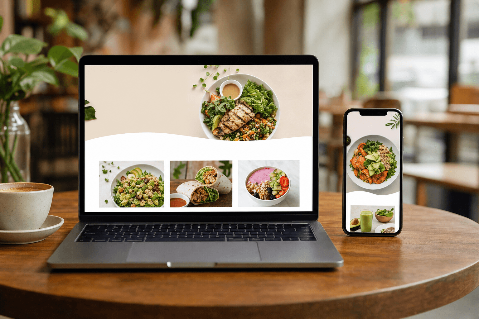
Most restaurant and cafe owners spend hours agonizing over font choices, color palettes, and hero photos — and then bolt on a navigation bar as an afterthought. That's backwards. Navigation is the skeleton of your website. Get it wrong and even the most beautiful site will frustrate visitors, bury your menu, and quietly cost you reservations and orders every single day.
This guide is for food and drink business owners who want a navigation structure that works — one that gets people to the right page in one or two clicks, on any device, without confusion.
Why Navigation Matters More Than You Think
People land on a restaurant or cafe website with a very specific goal. They want to see the menu, find your hours, get your address, or place an order. Research consistently shows that visitors decide within a few seconds whether a site is useful or not. If they can't immediately see how to get to the menu or find your location, they leave — and they probably open a competitor's site next.
Poor navigation doesn't just frustrate users; it also hurts your search rankings. Google's crawlers follow your internal links to understand your site's structure. A logical, clean navigation helps search engines index your most important pages and signals that your site is well-organized and trustworthy.
The good news: navigation for a food or drink business is not complicated. You don't have 200 pages to organize. You have maybe six to eight pieces of information people actually need. The challenge is resisting the urge to over-engineer it.
The Core Pages Every Food Business Website Needs
Before you think about navigation structure, get clear on what pages you actually need. For most restaurants, cafes, and bars, the essential pages are:
- Menu — The single most important page on your site. Every navigation decision should make this easier to reach.
- Order Online — If you offer online ordering or takeout, this deserves its own prominent link, not buried under the menu.
- Hours & Location — Address, hours, parking notes, and a map embed. Often combined with a Contact page.
- About — Your story, your team, your ethos. Shorter than you think. More personal than most businesses make it.
- Reservations or Book a Table — If you take reservations, this should be immediately visible, ideally as a button in the nav.
- Contact — Phone number, email, and a simple form. Can be merged with Hours & Location for smaller sites.
- Events or Specials — Optional. Only include this if you update it regularly. A stale "Events" page with a 2022 date is worse than no events page.
That's it. Seven pages at most, often fewer. If you're just starting out or running a lean operation, a well-built single-page site or a hosted menu page can cover all of this without any navigation complexity at all.
The Right Order for Your Nav Links
The order of items in your navigation bar is not arbitrary. People read left to right (on desktop) and expect the most important items to appear first. Here's a proven order for most food and drink businesses:
- Home — Usually represented by your logo on the left. You don't need a separate "Home" text link if your logo is clickable.
- Menu — First text link in the nav, always. No exceptions.
- Order Online — If applicable, second position. This is a revenue-generating action and should be easy to find.
- About — Third. People who want to know your story will look for it here.
- Hours & Location — Fourth. Critical for new visitors deciding whether to visit.
- Contact — Last text link, or merged with Hours & Location.
- Reserve / Book a Table — This should appear as a visually distinct button on the far right of the nav, not as a plain text link. Use a contrasting color to make it pop.
This structure puts the two things most visitors want — the menu and the ability to order or book — at the very front. Everything else supports the decision to visit or order.
Mobile Navigation: Your Real Priority
More than 70% of restaurant website visits happen on a mobile phone. That means your mobile navigation isn't a secondary consideration — it's the primary one. A navigation bar that looks elegant on a 27-inch monitor can become a cramped, unusable mess on a phone if you don't plan for it.
Keep it to five items or fewer in the mobile menu
On mobile, use a hamburger menu (the three-line icon) that expands to show your links. Limit this to five items maximum. If you have six pages, consider merging Hours and Contact into one page called "Find Us" to keep the count down.
Put a persistent CTA button on mobile
Many high-performing food business sites use a sticky bottom bar on mobile with two buttons: View Menu and Order Now (or Book a Table). This stays visible as users scroll and removes the need to hunt for the nav. It's one of the highest-impact changes you can make to a mobile site.
Test your tap targets
Navigation links on mobile need to be large enough to tap without zooming. Apple's Human Interface Guidelines recommend a minimum tap target of 44x44 points. If your nav links are small text with no padding, they will frustrate users and increase bounce rates.
How to Handle Your Menu Page in Navigation
The menu link deserves special attention because it's the most-visited page on almost every food business website. Here are the most common mistakes and how to avoid them:
Don't use a PDF as your menu
Linking to a PDF might seem easy, but PDFs don't render well on mobile, can't be indexed by search engines properly, and are a pain to update. A digital menu that lives on a real URL is faster to load, easier to read on any device, and far better for SEO.
Use dropdown menus sparingly
If you have multiple menus — say, a food menu, a drinks menu, and a brunch menu — a simple dropdown from the "Menu" nav item is acceptable. But keep the dropdown to three or four items. Mega-menus with dozens of links are overkill for a restaurant site and tend to confuse mobile users.
Consider a direct link to your online menu builder page
If you're using a hosted solution like MenuHoster's online menu maker, your menu already lives at a clean, shareable URL. You can link directly to it from your nav, embed it on your site, or use it as your standalone menu page. This keeps your menu always up to date without touching your website code.
Naming Your Navigation Links
The words you use in your nav links matter. Visitors are scanning, not reading. Use plain, predictable labels — not clever ones.
- Use "Menu" not "Our Offerings" or "What We Serve." People know what "Menu" means and they scan for it instinctively.
- Use "About" not "Our Story" or "Who We Are." Again, predictability wins.
- Use "Order Online" not "Get Food" or "Hungry?" Cute copy in navigation creates hesitation.
- Use "Find Us" or "Hours & Location" not "Come Visit." People searching for your address want a functional label, not an invitation.
The exception is your call-to-action button. "Reserve a Table," "Book Now," or "Order Now" can and should be action-oriented. Buttons are expected to have verb-led copy.
Footer Navigation: The Underrated Second Nav
Your footer is prime real estate that most food businesses waste. Visitors who scroll to the bottom of a page are highly engaged — they've read your content and are looking for next steps. A well-structured footer should include:
- Your address and phone number (plain text, not just a link)
- Opening hours
- Links to your main pages (Menu, Order Online, Reservations, Contact)
- Links to your social media profiles
- A link to your QR code menu if you use one for in-venue dining
- Any relevant legal pages (Privacy Policy, Allergen Information)
Having your address and hours in the footer also helps with local SEO. Google reads footer content and uses it to confirm your business's name, address, and phone number (NAP) — a key local ranking signal.
Navigation for Multi-Location Businesses
If you operate more than one location, navigation gets slightly more complex. The cleanest approach is to add a "Locations" page that lists each site with its own address, hours, and menu link. Avoid creating separate top-level nav items for each location — this bloats your nav and confuses visitors who don't yet know which location they want.
If your locations have meaningfully different menus (for example, a flagship with a full dinner menu and a second site that's counter-service only), each location page should link to its own menu rather than a shared one.
What to Leave Out of Your Navigation
Restraint is a feature. Here are things that don't belong in your main navigation:
- Blog or News — Unless you publish at least twice a month, a blog link in your nav signals neglect when visitors click it and find a post from 18 months ago. Keep blog links in the footer if you have one.
- Press or Media — Put this on your About page or in the footer. It's not a primary visitor need.
- Careers — Footer only, unless you're actively hiring and want to attract applicants.
- Gallery — Photos belong on your homepage and menu pages, not siloed in a separate gallery page that most visitors won't navigate to.
- Gift Cards — This can be a footer link or a banner on the homepage during peak seasons. It rarely needs a permanent nav slot.
Every extra link in your navigation reduces the visual weight of the links that actually matter. When everything is emphasized, nothing is.
A Simple Navigation Template for Food Businesses
If you want a starting point, here's a clean, proven nav structure that works for most restaurants, cafes, and bars:
- Logo (links to homepage) — far left
- Menu — first text link
- Order Online — second text link (if applicable)
- About — third text link
- Find Us — fourth text link (combines hours, address, map)
- Reserve a Table — button, far right, contrasting color
On mobile: hamburger menu containing Menu, Order Online, About, Find Us — plus a sticky bottom bar with "View Menu" and "Reserve" buttons.
This structure takes less than an afternoon to implement and will outperform 80% of food business websites in terms of usability. If you're building on one of MenuHoster's restaurant website templates, this structure is already baked in — you just need to fill in your content.
Testing Your Navigation
Once you've built or revised your navigation, test it before you publish. The five-second test is simple: show your homepage to someone who hasn't seen your site before (a friend, a family member, anyone). After five seconds, ask them: "Where would you click to see the menu?" and "How would you find your way to place an order?" If they hesitate or point to the wrong place, your navigation needs work.
Also test on an actual phone, not just a browser window resized to mobile dimensions. Real devices render fonts and tap targets differently, and what looks fine in Chrome DevTools can be unusable on an iPhone.
Frequently Asked Questions
How many links should a restaurant website navigation have?
Aim for five to six links maximum in your main navigation, plus one visually distinct call-to-action button (like "Reserve" or "Order Now"). More than six text links creates visual clutter and dilutes the importance of your most critical pages.
Should my menu be a PDF or a real web page?
Always a real web page. PDFs are hard to read on mobile, can't be updated without re-uploading a file, and don't contribute to your SEO. A hosted digital menu page is faster, more accessible, and far easier to keep current. You can create one in minutes with MenuHoster's menu builder.
Where should the "Order Online" button go in the navigation?
If online ordering is a meaningful revenue stream for your business, give it the second position in your nav (right after "Menu") and consider making it a button rather than a plain text link. The visual distinction signals to visitors that it's an action, not just information.
Do I need a separate page for hours and location, or can I put that on the Contact page?
For most small food businesses, combining hours, address, a map embed, and a contact form on a single "Find Us" or "Contact" page is perfectly fine. It reduces the number of nav items and keeps all practical visit-planning information in one place. Only split them if your hours section is genuinely complex (multiple locations, seasonal changes, etc.).
Does my navigation structure affect my Google ranking?
Yes, indirectly. A clear navigation helps Google's crawlers discover and index all your important pages. It also reduces bounce rate (because visitors find what they need quickly), which is a positive behavioral signal. Putting your most important pages — Menu, Order Online, Reservations — in the main nav ensures they get crawled and indexed with priority.
Ready to build a website that actually works for your food or drink business? MenuHoster's restaurant menu tools give you a clean, mobile-ready foundation — including a hosted menu page, QR code generation, and simple templates designed for exactly this kind of business. Sign up free and have your menu live in minutes, with navigation that gets out of the way and lets your food do the talking.
MenuHoster Team
Helping restaurants go digital