How to Structure Menu Categories So Guests Order More
Updated:
Most restaurant owners spend hours writing item descriptions and agonizing over prices, then throw all the items into categories like "Appetizers," "Mains," and "Desserts" without a second thought. That's a missed opportunity. The structure of your menu — what categories you create, what you name them, and what order they appear in — quietly shapes what guests order before they've even read a single description.
This guide covers the practical mechanics of menu category structure: how many categories to use, how to name them, how to sequence them, and how those decisions translate directly into higher check averages and happier guests.
Why Category Structure Matters More Than You Think
When a guest opens your menu — whether it's a printed booklet or a digital menu on their phone — they don't read it like a book. They scan it. Research in menu engineering consistently shows that guests spend an average of 109 seconds reviewing a menu before deciding. In that short window, your category structure does most of the heavy lifting.
A well-structured menu does three things:
- Reduces decision fatigue. Guests who feel overwhelmed order conservatively — they default to the cheapest or most familiar item, or they skip add-ons entirely.
- Guides attention to high-margin items. Category placement and naming influence which sections guests read first and most carefully.
- Increases the likelihood of multi-course ordering. Clear, inviting category names prompt guests to consider starters and sides they might otherwise skip.
None of this requires manipulation. It's just good information design — making it easy for guests to find what they want and discover things they didn't know they wanted.
How Many Categories Is Too Many?
There's no universal rule, but a practical ceiling for most independent restaurants is six to eight categories on a single menu. Beyond that, guests begin to skim rather than read, and the cognitive load of choosing a category before choosing a dish starts to feel like work.
The most common mistake is over-segmenting. A burger restaurant doesn't need "Classic Burgers," "Premium Burgers," "Signature Burgers," and "Chef's Burgers" as four separate sections. That forces the guest to decode your internal hierarchy before they can even look at the food. Consolidate where you can, and use visual cues — a callout box, a badge, a different background color — to highlight premium items within a unified category instead.
On the other end, under-segmenting is also a problem. Lumping everything into two or three giant categories means guests have to scroll through 20+ items in one block, which is exhausting on a phone screen. Aim for five to nine items per category as a general target. If a category is growing beyond ten items, look for a natural split.
Naming Categories That Actually Sell
Generic category names are invisible. "Appetizers" tells guests nothing they don't already know. Specific, evocative names do real work.
Use sensory or occasion-based language
Instead of "Appetizers," try "Share & Start" or "Small Plates to Kick Things Off." Instead of "Desserts," try "Something Sweet" or "To Finish." These names plant a behavioral suggestion — they imply a full meal arc, which naturally increases multi-course ordering.
Reflect your brand voice
A casual taco spot can get away with "Bites & Boards" or "The Good Stuff." A fine-dining restaurant might use "First Course" and "From the Grill." The category names should sound like the same voice that wrote your item descriptions. Inconsistency — formal dish names under a jokey category header — creates subtle friction.
Avoid internal jargon
Category names that make sense to your kitchen team ("Proteins," "Cold Apps," "Composed Plates") often confuse guests. Test your category names on someone who has never seen your menu. If they can't predict what they'll find in a section, rename it.
Be specific about format, not just content
"Bowls," "Flatbreads," "Handhelds" — format-based names work well because they set a clear expectation about portion size and eating style, which helps guests self-select quickly. This is especially effective on digital menus where guests may be ordering for pickup and want to know what they're getting without reading every description.
Sequence: Use the Primacy Effect Deliberately
People remember and pay more attention to the first and last items they encounter in a list — this is the primacy and recency effect. The same applies to menu categories.
The first category a guest sees on your menu sets the tone and often gets the most consideration. This is why high-margin categories like shareable starters, specialty drinks, or signature items deserve the top slot — not because you're tricking anyone, but because guests are most receptive at the beginning of their browsing session.
A practical sequence for a full-service restaurant might look like this:
- Drinks or Cocktails — ordered early, high margin, sets the mood
- Starters / Small Plates — encourages multi-course thinking from the start
- Mains — the core of the menu, where most guests will spend the most time
- Sides — positioned after mains so guests consider adding them
- Desserts — last, but given a compelling name and a few strong options
Notice that drinks come first. On a printed menu, this is sometimes skipped. On a digital menu, it's a powerful move — guests who order a drink early are more likely to stay longer and order more food. If you're building your menu with an online menu maker, you can reorder categories in seconds to test what sequence drives the best results.
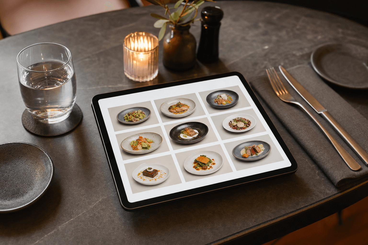
Category Structure on Digital and QR Menus
Digital menus introduce constraints and opportunities that printed menus don't have. On a phone, guests navigate by scrolling or tapping category tabs. This changes the rules slightly.
Tab-based navigation changes the primacy effect
When your digital menu uses horizontal tabs at the top (common on QR code menus), the first tab is still the most viewed — but guests can jump to any category instantly. This means every category name needs to be compelling on its own, not just in sequence. Weak category names get ignored entirely because it's so easy to skip them.
Keep category names short for mobile
On a phone screen, long category names get truncated in tab navigation. Aim for one to three words per category name. "Weekend Brunch Specials" might need to become "Brunch" with a subtitle or description handled elsewhere.
Use a "Featured" or "Chef's Picks" category strategically
A dedicated featured category — placed first — is one of the most effective structural moves you can make on a digital menu. It gives you a curated window to showcase your highest-margin, highest-quality items without guests having to hunt for them. Rotate it seasonally or weekly to keep regulars engaged. You can explore how this works in practice by looking at menu templates that already incorporate this structure.
Don't replicate your printed menu structure blindly
A printed menu with two columns and visual hierarchy doesn't translate to a phone screen. What works in print — a large center panel for mains, smaller side panels for extras — needs to be reimagined as a linear, scrollable flow for digital. Restructuring categories is the first step in that translation.
Subcategories: When They Help and When They Hurt
Subcategories — a header within a larger category — can help when a section genuinely has distinct groups that guests need to navigate. A wine list, for example, reasonably splits into "White," "Red," "Sparkling," and "By the Glass." A pizza menu might split into "Classic" and "Specialty."
But subcategories add visual complexity and should be used sparingly. A few tests before adding one:
- Does a guest actually need to know this distinction before ordering, or is it just organizational for your team?
- Does the subcategory have at least three items? A subcategory with one or two items looks like an afterthought.
- Could you achieve the same effect with a badge or label on individual items instead?
If the answer to any of these is no, skip the subcategory and keep the section flat. Simpler menus tend to produce higher check averages because guests spend their cognitive energy on choosing items, not decoding structure.
Applying Menu Engineering Logic to Category Decisions
Menu engineering classifies items into four quadrants based on popularity and profitability: Stars (high profit, high popularity), Plowhorses (popular but low margin), Puzzles (high margin but underordered), and Dogs (low on both). Most restaurant owners apply this framework at the item level — but it works at the category level too.
If your appetizer category is a Star — guests order starters frequently and the margin is strong — that category deserves prime placement and a compelling name. If your desserts are Puzzles — good margin, but guests rarely order them — consider whether the category name, position, or presentation is working against you. Moving "Desserts" to a more prominent position, renaming it, or adding a two-item "featured sweets" callout within the mains section can all increase dessert attach rates without changing a single recipe.
For a deeper look at the full discipline, see our guide on building a profitable restaurant menu from the ground up.
How to Test Whether Your Structure Is Working
The best category structures are discovered through iteration, not guesswork. Here's how to measure what's working:
- Track category-level sales data. If you're using a POS system, pull item sales by category weekly. A category that consistently underperforms — relative to the number of items in it — is a signal to reconsider its name, position, or composition.
- Watch for "skip" patterns on digital menus. Some digital menu platforms offer analytics on which sections get the most views. If a category is being skipped, it's usually a naming or sequencing problem, not a product problem.
- Ask your servers. Front-of-house staff hear guest confusion in real time. If guests frequently ask "where are the sides?" or "do you have appetizers?", your category names or structure aren't communicating clearly.
- Run a simple A/B test. On a digital menu, try renaming one category for two weeks and compare sales in that section before and after. This is easy to do if your menu is managed digitally — no reprinting required.
The ability to update categories instantly without reprinting anything is one of the most underappreciated advantages of digital menus. If you're still working from a static PDF, consider how much faster you could iterate with a fully editable digital menu.
Common Structural Mistakes to Avoid
- Burying high-margin categories. Putting your most profitable section at the bottom of the menu because it's "just sides" or "just drinks" costs you money every service.
- Too many categories with too few items. A category with one or two items looks like an oversight. Either expand it or fold those items into an adjacent category.
- Inconsistent naming conventions. Mixing formal names ("First Course") with casual names ("The Good Stuff") in the same menu creates tonal whiplash.
- Ignoring the mobile experience. A category structure designed for a tri-fold printed menu will almost certainly be confusing on a phone. Design for mobile first, then adapt for print.
- Never updating the structure. Your menu's category structure should evolve as your sales data evolves. A seasonal menu change is a good opportunity to reassess whether the structure still fits.
Frequently Asked Questions
How many menu categories should a restaurant have?
Most independent restaurants perform best with six to eight categories. Fewer than four can make the menu feel sparse or hard to navigate; more than eight increases decision fatigue. The right number depends on the breadth of your offering — a focused concept with 20 items needs fewer categories than a full-service restaurant with 60.
Should drinks be listed first on a restaurant menu?
Generally, yes — especially on digital menus. Guests who order drinks early tend to stay longer and order more food. Placing your beverage category first also sets the atmosphere for the meal and gives your high-margin drinks maximum visibility.
What's the best way to name menu categories?
Use short, specific, occasion-based language that matches your brand voice. Avoid generic labels like "Appetizers" and "Mains" where possible. Names like "Share & Start," "From the Grill," or "Something Sweet" do more to guide behavior and set expectations than standard category labels.
Does menu category structure matter more on digital menus than printed ones?
It matters on both, but the stakes are higher on digital. On a phone, guests navigate by tapping category tabs or scrolling — weak category names get skipped entirely. On a printed menu, a guest's eye still wanders across the page and may land on something interesting. Digital menus reward clarity and strong naming more directly.
How often should I update my menu category structure?
Review your category structure at least twice a year — typically when you do a seasonal menu update. If you're tracking sales data and notice a category consistently underperforming, don't wait for the next formal review. On a digital menu, making structural changes takes minutes and costs nothing.
Ready to put these principles into practice? MenuHoster makes it easy to build, organize, and update your menu categories in real time — no design skills or reprinting required. Try it free and see how a cleaner menu structure can translate directly into higher check averages for your restaurant.
MenuHoster Team
Helping restaurants go digital