Menu Engineering Basics: How to Lay Out a Profitable Menu
Updated:
Most restaurant owners think about their menu as a list of what they sell. Menu engineers think about it as a sales tool. The difference in revenue between those two perspectives can be significant — studies consistently show that thoughtful menu layout can increase average check size by 10–15% without changing a single recipe or price.
Menu engineering is the practice of analyzing and arranging your menu items based on their profitability and popularity, then using layout, language, and visual hierarchy to steer customers toward the items that are best for your bottom line. It's been practiced in large restaurant chains for decades, but every independent operator can apply the same principles — especially now that digital menus make updates fast and free.
This guide covers the core concepts, the practical layout decisions, and how to apply them whether you're working with a printed menu, a PDF, or an online menu.
The Four Menu Item Categories
The foundation of menu engineering is a simple 2×2 matrix developed by professors Donald Smith and Michael Kasavana at Michigan State University in the 1980s. Every item on your menu falls into one of four categories based on two variables: popularity (how often it's ordered) and profitability (how much contribution margin it generates).
Stars: High Popularity, High Profit
Stars are your best performers. Customers order them frequently and they make you good money. Your job is to make sure these items are easy to find, visually prominent, and never accidentally buried. These are the items you want to lead with.
Plowhorses: High Popularity, Low Profit
Plowhorses sell well but don't contribute much to your bottom line. Classic examples include a house burger or a basic pasta that customers expect at a low price point. The strategy here is to either raise the price incrementally, reduce portion cost, or bundle them with a higher-margin side to improve their contribution.
Puzzles: Low Popularity, High Profit
Puzzles are items that would make you good money if people ordered them — but they don't. This is often a marketing and placement problem, not a quality problem. Moving a puzzle item to a more prominent position, adding a photo, or rewriting its description can turn it into a star.
Dogs: Low Popularity, Low Profit
Dogs are the hardest to justify keeping. They take up space, complicate your kitchen operations, and don't earn their place. In most cases, the right move is to cut them. A shorter, tighter menu is almost always more profitable than a sprawling one.
How to Calculate Contribution Margin
Before you can categorize your items, you need to know each item's contribution margin — not just its price or food cost percentage.
The formula is simple:
Contribution Margin = Selling Price − Food Cost
For example, a pasta dish that sells for $18 with $4 in food cost has a contribution margin of $14. A steak that sells for $42 with $22 in food cost has a contribution margin of $20. Even though the steak has a higher food cost percentage, it contributes more actual dollars to covering your labor, rent, and profit.
This is a critical distinction. Food cost percentage is a useful operational metric, but contribution margin is what actually pays your bills. Menu engineering prioritizes contribution margin over food cost percentage when making placement decisions.
To categorize items, calculate the average contribution margin across all your items. Items above average are "high profit"; items below average are "low profit." Do the same with sales volume — items ordered more than average are "high popularity." This gives you your four quadrants.
The Golden Triangle and Eye Movement
Research into how diners read menus shows a consistent pattern. On a single-page or two-panel menu, the eye tends to land first in the upper right corner, then move to the top left, then sweep down the center. This path is sometimes called the "golden triangle."
What this means practically:
- Place your highest-margin stars in the upper right section of a panel or page.
- Use the top-left position for your second-best performers.
- Avoid putting your most profitable items at the very bottom of a long list — they'll get less attention.
- If you use a single-column layout (common on digital menus), the first and last items in each category get the most attention. Place stars at the top of each section.
On a digital restaurant menu, scrolling behavior replaces the golden triangle, but the principle is the same: the first item a customer sees in any category is the one they're most likely to order. Lead every section with your best item.
Category Structure and Naming
How you group and label your menu sections has a direct effect on what gets ordered. A few concrete guidelines:
Keep the number of categories manageable
Research suggests that when people are presented with too many choices, they experience decision fatigue and default to familiar, lower-margin items — or nothing at all. Aim for 5–7 categories on a full-service menu. If you have more, consider consolidating. "Small Plates" and "Starters" can often be one section.
Use descriptive, sensory category names
Compare "Salads" to "Fresh & Seasonal." The second signals quality and freshness, which primes the customer to perceive higher value before they've read a single item. Category names are free real estate — use them.
Limit items per category
The sweet spot for most categories is 6–8 items. More than that, and customers start skimming rather than reading. Fewer than 4, and the section can feel thin. If you have 12 pasta dishes, consider breaking them into two focused subcategories rather than listing all 12 together.
Item Descriptions That Sell
Menu copy is one of the most underused profit levers in the restaurant industry. A Cornell University study found that descriptive menu labels increased sales of those items by 27% and led to higher customer satisfaction ratings — without changing the food at all.
Effective menu descriptions share a few traits:
- They're specific, not generic. "Slow-braised short rib with roasted garlic mash and red wine jus" outperforms "braised beef with mashed potatoes" every time.
- They use sensory language. Words like crispy, velvety, smoky, tangy, and charred trigger appetite more than functional descriptions.
- They reference origin or technique when relevant. "Vermont cheddar," "wood-fired," or "house-made" signal quality and justify price.
- They're concise. Two to three lines is usually enough. Long descriptions slow down ordering and frustrate customers who are in a hurry.
Avoid superlatives like "amazing," "incredible," or "the best." They're vague, they sound like marketing copy, and experienced diners tune them out.
Pricing Strategy and Visual Anchoring
How you display prices affects how customers perceive value — and what they order.
Remove the dollar sign where possible
Studies show that menus without dollar signs lead to higher average spend. The "$" symbol activates the part of the brain associated with pain of paying. On a printed menu, using just the numeral (e.g., "18" instead of "$18.00") can soften that response.
Avoid right-aligned price columns
When prices are lined up in a column on the right side of the menu, customers scan the column and order based on price rather than reading descriptions. Instead, embed the price at the end of the description in the same font size. This keeps the focus on the dish, not the cost.
Use anchor pricing
Place one or two high-priced items at the top of a section. These anchors make the items below them feel more reasonably priced by comparison. A $65 wagyu steak at the top of the entrée section makes a $34 salmon feel like a bargain — even if $34 is still a strong margin item for you.
Price in intervals that feel intentional
Prices like $13, $17, and $23 feel more considered than $12.99, $16.99, and $22.99. The ".99" convention is associated with fast food and discount retail. For a sit-down restaurant, clean numbers read as more confident and premium.
Using Visual Elements Strategically
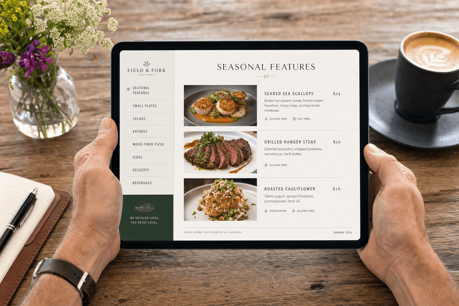
Not every item deserves a photo or a callout box. When everything is highlighted, nothing is. Use visual emphasis selectively to draw attention to your stars and puzzles.
- Photos: Use high-quality images for 2–4 items per section, maximum. On a digital menu, a single well-shot photo of a star item will do more work than a grid of mediocre photos for every dish. For more on this, see our guide on whether to use AI food images on your menu.
- Boxes and borders: A simple bordered callout around a "Chef's Recommendation" or "Most Popular" item draws the eye immediately. Use this for one item per section, not five.
- Icons: Small icons for spice level, vegetarian, gluten-free, or house-made can help customers filter quickly without cluttering descriptions.
- White space: A crowded menu feels cheap and overwhelming. Generous spacing between items signals quality and makes the menu easier to navigate.
Applying Menu Engineering to Digital Menus
Digital menus give you something printed menus never could: the ability to update instantly, test changes, and act on what you learn. If you notice a puzzle item isn't moving, you can rewrite its description, add a photo, or move it to the top of its section — and see results within days, not the next print run.
With an online menu maker, you can also run seasonal variations, test different item orders, and keep your menu current without any design or printing costs. That agility is a real competitive advantage for independent operators.
A few digital-specific tips:
- Keep your most important categories accessible without excessive scrolling. Consider a sticky navigation bar or category tabs at the top.
- On mobile (where most customers will view your menu), images should load fast and descriptions should be scannable. Avoid walls of text.
- If you're converting a PDF menu to a digital format, don't just upload the PDF. A PDF-to-QR-code menu is a quick starting point, but a properly structured digital menu will always outperform a scanned document on mobile devices.
How Often to Review and Update Your Menu
Menu engineering isn't a one-time exercise. Your item mix, food costs, and customer preferences shift over time. A practical review schedule:
- Quarterly: Pull sales data and recalculate contribution margins. Identify any items that have moved between categories. Cut dogs that haven't improved.
- Seasonally: Update descriptions and photos to reflect seasonal ingredients. Introduce limited-time items to test potential new stars.
- After price changes: Any time food costs shift significantly (which they do), recalculate your margins and adjust prices or portions accordingly before the impact compounds.
The restaurants that treat their menu as a living document — rather than something that gets redesigned every three years — consistently outperform those that don't.
Frequently Asked Questions
What is menu engineering in simple terms?
Menu engineering is the process of analyzing which items are most popular and most profitable, then designing your menu layout to guide customers toward ordering those items. It combines data analysis with design and copywriting to increase your average check size and overall profitability.
How many items should a restaurant menu have?
There's no universal number, but research consistently shows that smaller menus outperform larger ones. For most independent restaurants, 20–35 items across all categories is a manageable range that reduces decision fatigue, simplifies kitchen operations, and makes it easier to maintain quality. If your menu has 60+ items, it's worth auditing it seriously.
Does menu engineering work for digital menus?
Yes — and in some ways it works better. Digital menus allow you to update placement, descriptions, and photos instantly based on what you observe. You're not locked into a print run. The same principles of item categorization, visual hierarchy, and descriptive copy apply fully to digital formats.
Should every item on the menu have a photo?
No. Using photos selectively — for your stars and key puzzle items — makes them stand out. When every item has a photo, none of them do. Prioritize high-quality images for 2–4 items per section and leave the rest as text-only descriptions.
How do I know if my menu layout is working?
Track your item sales mix over time. If your stars are consistently your top sellers and your contribution margin per cover is increasing, your layout is doing its job. If customers are gravitating toward your lowest-margin items, it's worth revisiting placement, descriptions, and pricing strategy. Most POS systems can generate item-level sales reports that make this analysis straightforward.
Ready to put these principles into practice? MenuHoster's online menu maker lets you build a clean, professional digital menu in minutes — with full control over layout, categories, descriptions, and photos. Explore our menu templates to find a starting point that fits your restaurant's style, and start turning your menu into the sales tool it should be.
MenuHoster Team
Helping restaurants go digital