How to Use White Space and Visual Hierarchy to Make a Menu Easier to Read
Updated:
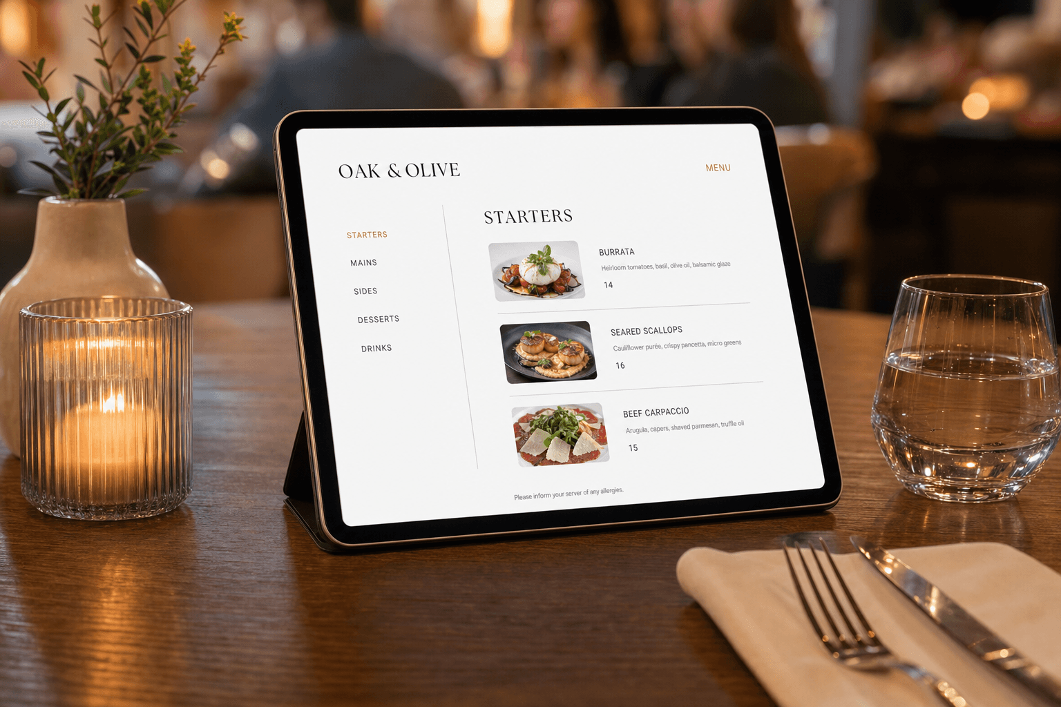
A menu is not just a list of food and prices. It is the primary sales tool in your restaurant, and how it looks determines how much guests spend, how quickly they decide, and how confident they feel about their order. Most independent restaurants underinvest in menu layout — not because they don't care, but because the principles of visual design feel abstract or out of reach.
They're not. White space and visual hierarchy are two of the most powerful and accessible tools in menu design. You don't need a graphic design degree to apply them. You need to understand what they are, why they work, and how to apply them systematically — whether you're designing a printed menu, a PDF, or a digital menu.
What Visual Hierarchy Actually Means
Visual hierarchy is the arrangement of elements so that the eye moves through them in a deliberate order — from most important to least. On a menu, hierarchy tells guests: here's what to look at first, here's how to navigate, and here's where to focus.
When hierarchy is absent, everything competes for attention equally. The result is a menu that feels cluttered, overwhelming, or cheap — even if the food is excellent. Guests scan randomly, miss your best items, and take longer to order. That slows table turns and increases the chance they default to something familiar rather than something profitable.
Strong visual hierarchy works through four levers:
- Size: Larger text draws the eye first. Section headers should be noticeably larger than item names, which should be noticeably larger than descriptions.
- Weight: Bold text signals importance. Use it for item names or prices you want noticed, not for decoration.
- Color: A single accent color used sparingly (for a featured item, a "Chef's Pick" label, or a section divider) creates a visual anchor without creating noise.
- Position: Guests read menus in predictable patterns. On a single-page menu, the eye typically goes to the top center or top-right first. On a multi-section menu, the first and last items in a section get the most attention.
The goal is not to make your menu look fancy. The goal is to make it effortless to read — so guests spend their mental energy on deciding what they want, not on figuring out how to read the page.
The Role of White Space
White space (also called negative space) is the empty area between and around design elements. It does not have to be white — it's simply the breathing room you give your content.
Many restaurant owners instinctively try to fill every inch of a menu. More items visible at once feels like better value for money. In practice, the opposite is true. A dense menu signals chaos. A menu with generous spacing signals confidence and quality.
Here's what white space actually does for your menu:
It reduces cognitive load
When items are tightly packed, the brain has to work harder to separate them. Adequate spacing between items lets each one register as a distinct choice. Guests process the menu faster and feel less overwhelmed — which means they're more likely to order something adventurous rather than retreating to the safest-sounding item.
It elevates perceived quality
Luxury brands, high-end restaurants, and premium products all use generous white space. It's not a coincidence. Space communicates that each item deserves attention. A menu that gives every dish room to breathe says: we're proud of this, and we want you to consider it properly.
It guides the eye naturally
White space creates visual lanes. When there's clear space between sections, between items, and between the item name and its description, the eye follows a natural path down the page. You're not fighting for attention — you're directing it.
Practical Rules for Spacing Your Menu
Abstract principles are useful, but let's get specific. Here are the spacing decisions that make the biggest practical difference:
Section spacing vs. item spacing
The space between sections should always be larger than the space between individual items within a section. This is the single most important spacing rule on a menu. If the gap between "Starters" and "Mains" looks the same as the gap between two appetizers, guests lose track of where one category ends and another begins. A clear visual break — double the spacing, a thin rule line, or a section header with extra padding above it — solves this immediately.
Item name to description spacing
Keep the item name and its description close together. They belong to the same unit of information. Then leave more space before the next item. This grouping (called the Gestalt principle of proximity) makes the menu scannable: guests can skim item names quickly, and only slow down to read descriptions when something catches their interest.
Margins and edge breathing room
On both printed and digital menus, content that runs close to the edge of the page or screen feels cramped. A generous margin — especially on the left and right — makes the whole menu feel more intentional. For digital menus viewed on mobile, this is especially important: tight margins on a small screen make text feel claustrophobic and hard to tap.
Price placement
Avoid the classic price-column layout where item names are on the left and prices are right-aligned on the far right, connected by a dotted line. This layout was designed for ledgers, not menus. It trains the eye to jump directly from name to price, encouraging guests to compare costs rather than evaluate dishes. Instead, place the price immediately after the item name or at the end of the description in the same text block. This keeps focus on the food, not the number.
Typography Choices That Support Hierarchy
You don't need a typography course to make smart font decisions. You need a few clear rules:
Use no more than two typefaces
One for headers (section names, featured items) and one for body text (item names, descriptions, prices). More than two creates visual noise. If you want contrast, vary the weight and size of the same typeface rather than introducing a third one.
Set a clear type size scale
A practical scale for a restaurant menu: section headers at 18–22px (or equivalent in print), item names at 14–16px, and descriptions at 12–13px. The difference in size should be obvious at a glance. If you have to squint to notice the difference between a section header and an item name, the hierarchy isn't working.
Line length and line height
Long lines of text are hard to read. For menu descriptions, aim for no more than 60–70 characters per line. And give your lines room to breathe: a line height of 1.4–1.6x the font size is comfortable for reading. Cramped line spacing makes descriptions feel like fine print — guests will skip them entirely.
Avoid all-caps for body text
All-caps can work for short section headers or labels. It should never be used for item descriptions or anything longer than four or five words. All-caps text is significantly slower to read and creates a sense of shouting rather than invitation.
Applying Hierarchy to Highlight Your Best Items
Visual hierarchy isn't just about making the menu readable — it's about making it profitable. Strategic emphasis on high-margin or signature items directly influences what guests order.
A few techniques that work:
- Boxes or shading: A lightly shaded box around one or two featured items draws the eye without disrupting the flow of the rest of the menu. Use this sparingly — if everything is highlighted, nothing is.
- Icons or badges: A small "Chef's Pick" or "Most Popular" label next to an item provides social proof and visual distinction at the same time. Keep it minimal: one or two icons per section maximum.
- Section placement: Put your highest-margin items at the top of their section, or in the first section that appears on the menu. The first item in any list gets disproportionate attention.
- Anchor items: Include one deliberately premium item in each section. Its presence makes the items around it seem more reasonably priced — and it occasionally gets ordered, which is pure margin.
If you're building or updating a digital menu, the MenuHoster online menu maker gives you structured layout tools that apply these hierarchy principles automatically — so you're not starting from scratch.
Digital Menus and Mobile-Specific Considerations
If your menu is viewed on a phone — and for most restaurants, the majority of digital menu views are — the rules above apply with even more urgency. Mobile screens are small, thumbs are imprecise, and guests are often in a noisy, distracted environment.
Key adjustments for mobile menu layouts:
- Single-column layouts only. Two-column menus that work on desktop become unreadable on mobile. Stack everything vertically.
- Larger tap targets. Item names and any interactive elements should be large enough to tap comfortably — at least 44px tall. Tiny text that requires pinch-zooming kills the experience.
- Sticky section navigation. On a long menu, a sticky header or tab bar that lets guests jump directly to "Mains" or "Desserts" saves them from endless scrolling. This is a hierarchy tool: it tells guests how the menu is organized before they've read a single item.
- Images used deliberately. A photo next to every item creates visual clutter on mobile. Use images for featured items or sections where a visual really sells the dish. Consistent image sizing matters — mismatched thumbnails make the layout feel broken.
When guests scan a QR code at the table, the first few seconds of their experience with your digital menu shape their entire impression of the meal. A well-spaced, clearly hierarchical mobile menu communicates professionalism before they've read a word. You can explore how this works in practice with MenuHoster's restaurant menu tools.
Common Mistakes That Undermine Readability
Even well-intentioned menu designs fall into predictable traps. Here are the most common ones and how to fix them:
Too many sections
If your menu has more than seven or eight sections, guests will feel overwhelmed before they start reading. Consolidate where you can. "Small Plates" and "Starters" can usually be one section. "Sides" and "Extras" can be combined. Fewer sections with clear names reduce decision fatigue significantly.
Inconsistent formatting
If some item names are bold and some aren't, if some descriptions are italicized and some aren't, if prices appear in different positions across sections — the menu feels unfinished. Consistency is not just aesthetic; it's functional. Consistent formatting lets the eye build a reading rhythm. Inconsistency breaks that rhythm on every item.
Descriptions that are too long
A two-sentence description is almost always better than four sentences. Guests are not reading your menu like a food article. They're scanning for cues. "Slow-braised lamb shoulder, white bean purée, gremolata" tells them everything they need. A paragraph about the farm the lamb came from, the inspiration for the dish, and the chef's childhood memory of eating lamb does not. Save the story for section introductions, where guests opt in to reading more.
Decorative elements that compete with content
Ornate borders, heavy background textures, and decorative dividers between every item create visual noise that competes with the actual content. Decoration should support the hierarchy, not fight it. A single thin line between sections is more effective than an elaborate illustrated border.
A Simple Audit You Can Do Today
You don't need to redesign your entire menu to start improving it. Run this quick audit:
- Print your menu or open it on your phone. Squint at it until the text is blurry. Can you still see the section structure? If not, your hierarchy isn't strong enough.
- Count your sections. More than eight? Consolidate.
- Check your spacing. Is the gap between sections clearly larger than the gap between items? If not, add more space above section headers.
- Find your highest-margin item in each section. Is it in the top two positions? If not, move it up.
- Read one description out loud. Does it take more than ten seconds? Trim it.
These five steps will surface the most impactful issues in under fifteen minutes. If you're ready for a more thorough overhaul, browsing MenuHoster's menu templates is a fast way to see well-structured layouts in action and adapt one to your brand.
Frequently Asked Questions
How much white space is too much on a menu?
White space becomes a problem only if it forces guests to scroll excessively on a digital menu or if it leaves a printed menu feeling sparse and incomplete. The test is whether the spacing aids navigation or creates confusion. If guests can find any section within a few seconds and each item reads as a distinct unit, your spacing is working. If the menu feels half-finished or items seem randomly distributed across a large page, pull the spacing back slightly.
Should I use the same layout for my printed menu and my digital menu?
Not exactly. The principles are the same — hierarchy, spacing, consistent typography — but the execution differs. Printed menus can support two-column layouts and smaller type. Digital menus, especially on mobile, need single-column layouts, larger text, and touch-friendly spacing. If you're converting a printed menu to digital, don't just upload a PDF. Rebuild the layout for the screen.
How many items should each section have?
Research on decision-making consistently shows that more options lead to less satisfaction and slower decisions. A practical guideline: four to eight items per section is a comfortable range. If you have more, consider whether some items can be rotated as specials rather than permanent menu fixtures, or whether two similar sections can be merged.
Does visual hierarchy matter as much for a QR code menu as for a printed one?
It matters more. A printed menu is a physical object guests hold and control. A digital menu on a phone is a small screen with limited context. Without strong hierarchy and clear spacing, guests get lost quickly and either ask staff for help (increasing your labor burden) or order something safe and familiar rather than exploring your menu. Good hierarchy on a digital menu directly impacts average order value.
Can I apply these principles without hiring a designer?
Yes. The core rules — clear size contrast between headers and body text, more space between sections than between items, no more than two typefaces, price placement within the item block — can be applied in any menu builder or word processor. The key is to make deliberate decisions rather than accepting default settings. Platforms like MenuHoster are built around these principles, so the structure is already there; you just need to fill it in consistently.
A menu that's easy to read is a menu that sells. If your current menu makes guests work harder than it should, the fix is usually not more content — it's better structure, more breathing room, and a clearer visual path from top to bottom. Try MenuHoster's online menu maker to build a menu with professional hierarchy and clean spacing built in from the start — no design experience required.
MenuHoster Team
Helping restaurants go digital