How to Structure Your QR Menu for Faster Table Turns and Less Decision Fatigue
Updated:
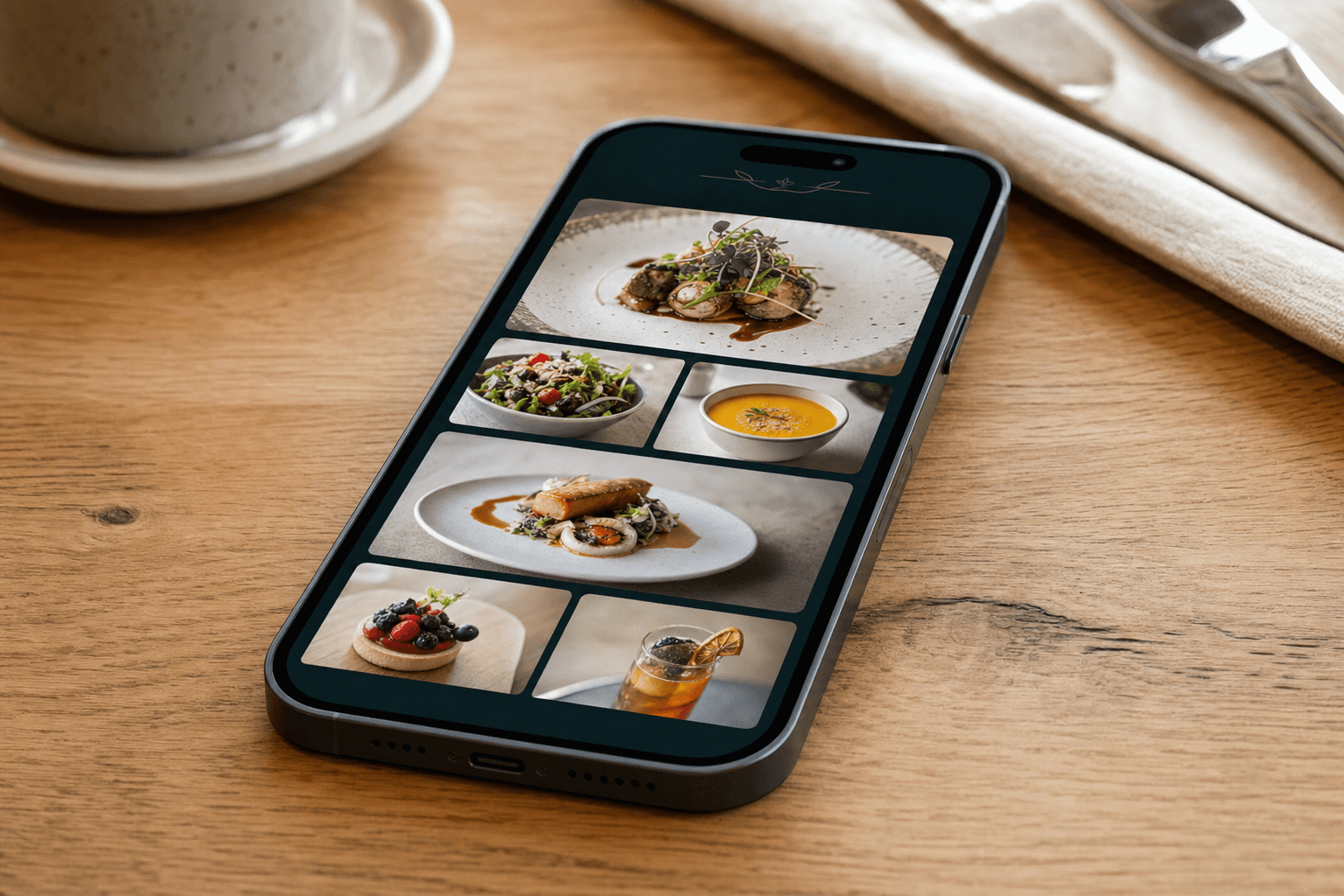
A QR menu that takes three minutes to load, lists 90 items in no particular order, and buries the drinks at the bottom isn't a digital upgrade — it's a paper menu with extra steps. And when guests sit down hungry, confused, or overwhelmed, they don't order faster. They stall, ask more questions, and hold up the table longer than they would have with a laminated card and a server hovering nearby.
The good news: QR menus, when structured well, genuinely do speed up ordering. Research on consumer psychology consistently shows that reducing the number of choices — or at least making choices feel manageable — leads to faster, more confident decisions. Your menu structure is the single biggest lever you have over that experience. This guide walks through exactly how to pull it.
Understand Decision Fatigue Before You Design
Decision fatigue is real and measurable. The more choices a person evaluates, the worse their decision-making quality becomes — and the more likely they are to default to either the first thing they see or nothing at all. For restaurants, "nothing" often means: "I'll just have what they're having," a long back-and-forth with the server, or a slower, more hesitant order.
On a digital menu, decision fatigue is amplified by a few factors unique to screens:
- Infinite scroll anxiety: Guests don't know how long the menu is. Every scroll feels like more is coming.
- No spatial memory: On paper, people remember roughly where something was on the page. On a phone, items blur together after scrolling.
- Cognitive load from formatting: Poor typography, inconsistent item names, and walls of description text all burn mental energy before a guest even starts deciding.
Your goal is to reduce all three. Structure does most of that work before a single word of copy is written.
Start With the Right Number of Categories
Category navigation is the skeleton of your QR menu. When guests tap a QR code and land on your digital menu, the first thing they should see is a short, scannable list of sections — not a wall of items.
The sweet spot for most casual and mid-range restaurants is 5 to 8 categories. Fewer than five and you're likely lumping unrelated items together in ways that confuse guests. More than eight and the navigation bar becomes its own source of overwhelm.
Common mistakes to avoid:
- Too granular: Splitting "Salads" into "Garden Salads," "Grain Bowls," and "Chopped Salads" as separate top-level categories adds navigation steps without helping guests decide.
- Too vague: A category called "Mains" that contains burgers, pasta, fish, and steak forces guests to scan everything to find what they want.
- Inconsistent naming: Mixing formal names ("Entrées") with casual ones ("Small Bites") creates a subtle tonal confusion that slows reading.
Name categories the way your guests think, not the way a culinary school textbook would. "Starters," "Burgers," "Pasta," "Mains," "Sides," "Drinks," "Desserts" — clear, fast, done.
Limit Items Per Category
The "paradox of choice" effect — popularized by psychologist Barry Schwartz — is especially punishing in food categories. When a category has more than seven or eight items, guests slow down significantly. When it has more than twelve, many simply pick the first or last item they read, or ask a server for help.
A practical target: 6 to 10 items per category. If you have 15 burgers, consider whether 5 of them are truly pulling their weight. Trimming the menu isn't just good for decision fatigue — it often improves kitchen efficiency and food cost at the same time.
If you genuinely can't cut items (catering menus, seasonal specials, dietary variants), use sub-categories or filters rather than dumping everything into one scrollable list. A "Dietary" filter that lets guests show only vegan or gluten-free items is far less fatiguing than reading every item to check.
Sequence Categories Strategically
The order of your categories isn't just organizational — it shapes how guests move through a meal and how quickly they commit to an order. A logical sequence mirrors the natural flow of a dining experience:
- Drinks (especially if you want to capture a drinks order while guests browse food)
- Starters / Appetizers
- Mains (broken out by type if needed)
- Sides
- Desserts
- Specials (if applicable — more on this below)
Putting drinks first is a deliberate tactic. A server can take a drinks order quickly, which commits the table to staying, generates early revenue, and buys time for guests to browse food. A well-structured QR menu can replicate this — guests see drinks first, tap one, and feel like they've made progress before tackling the harder decisions.
Specials deserve their own section near the top, not buried in the middle of a category. If you've gone to the trouble of creating a special, make it visible. A "Today's Specials" or "Chef's Picks" section at the top of the menu also serves as a decision shortcut — guests who trust the restaurant often just order from it.
Use Anchoring and Placement to Guide Decisions
Within each category, item placement matters more than most operators realize. Eye-tracking studies on both print and digital menus consistently show that guests pay most attention to the first two and last one items in any list. The items in the middle get the least scrutiny.
Use this to your advantage:
- Place your highest-margin items at the top of each category. They'll get seen first and ordered most often. For a deeper look at this tactic, see our guide on using your QR menu to highlight high-margin dishes.
- Use the last slot in a category for a "safe" crowd-pleaser that guests who scrolled all the way down can feel good about choosing.
- Avoid putting your most complex or time-consuming dishes at the top of a category if table turn speed is a priority during peak hours.
Price anchoring also plays a role. If your most expensive item in a category appears first, everything else looks reasonably priced by comparison. If your cheapest item appears first, guests anchor low and may resist spending more. Think carefully about which direction you want to nudge.
Write Descriptions That Decide, Not Just Describe
Long menu descriptions are one of the most overlooked sources of decision fatigue on digital menus. When every item has four lines of text, guests have to read a small essay before they can even compare options. Most won't. They'll skim, miss key details, and either ask a server or pick randomly.
The rule: one sentence, maximum two. Lead with the most distinctive or appetizing element, then add one qualifier (dietary, allergen, or flavor note) if needed.
Compare these two approaches:
- Too long: "Our slow-braised short rib is cooked for 12 hours in a red wine reduction with aromatics including thyme, rosemary, and bay leaf, then served atop a creamy Parmesan polenta with a side of seasonal roasted vegetables and a drizzle of herb oil."
- Right length: "12-hour red wine braised short rib, Parmesan polenta, roasted vegetables. (GF)"
The second version takes two seconds to read. The first takes fifteen. Multiply that across ten items and you've added two and a half minutes of reading time per guest — time they spend staring at their phone instead of talking to their table and being ready to order.
Use Visual Hierarchy and Badges Sparingly
Badges like "Popular," "Chef's Pick," "New," or "Spicy" are useful decision shortcuts — but only when used sparingly. If every item has a badge, none of them mean anything. Guests learn to ignore them, and you've added visual noise without adding value.
A practical approach:
- Use "Popular" on no more than 2–3 items per category. These act as social proof and reduce the anxiety of making the "wrong" choice.
- Use "New" only on items that are genuinely new — and remove it after 4–6 weeks.
- Use dietary icons (V, VG, GF, N) consistently across all items rather than writing out "gluten-free" in every description.
- Reserve featured images for 3–5 hero dishes rather than photographing every item. A photo next to every item creates visual clutter and slows page load.
A clean, uncluttered layout communicates confidence in your food. Menus that feel designed — rather than assembled — make guests feel like they're in good hands, which itself speeds up ordering.
Optimize for the Phone Screen, Not the Printed Page
Most guests will open your QR menu on a phone, in portrait orientation, often in low restaurant lighting. The structural choices that work on a printed menu don't always translate. A few specific adjustments for mobile:
- Sticky category navigation: A fixed tab bar or sticky header that lets guests jump between categories without scrolling back to the top saves significant time and frustration.
- Tap targets, not hover states: Buttons, expandable descriptions, and add-to-order actions need to be large enough to tap with a thumb. Tiny text links fail on mobile.
- Fast load time: Every second of load time increases bounce rate. Compress images, avoid autoplay video, and use a platform that prioritizes performance. A dedicated contactless menu platform handles this better than a PDF or a generic website builder.
- No PDFs: A PDF requires pinching, zooming, and horizontal scrolling — the exact opposite of a frictionless experience. If you're currently linking to a PDF, consider upgrading to a proper digital menu. Our PDF to QR code menu converter makes the transition straightforward.
Build In Decision Shortcuts for Peak Hours
During a Friday dinner rush, you want guests making decisions in under three minutes. A few structural features can help compress that window:
- "Quick order" or "Most popular" section: A short curated list of 5–8 items that covers starters, mains, and a drink. Guests who are overwhelmed or in a hurry can use this as a complete meal guide without browsing the full menu.
- Combo or set meal options: Pre-bundled choices eliminate the need to make three separate decisions (starter + main + drink) and often increase average spend at the same time.
- Clear upsell prompts at the item level: "Add a side for $3" or "Make it a meal" at the point of selection is faster than requiring guests to navigate back to the sides category separately.
For a tactical deep-dive on using QR menus during service peaks, see our guide on QR code table tents to speed up ordering during peak hours.
Test Your Menu as a Guest, Not an Owner
Owners and managers are the worst judges of their own menus. You know the menu by heart, so you can't experience the confusion a first-time guest feels. Before you go live — and after every significant update — test the menu cold:
- Hand your phone to someone who has never seen the menu and ask them to pick a starter, main, and drink. Time them. Watch where they hesitate.
- Scan the QR code yourself on a device you don't normally use. Notice load time, font size, and whether the category navigation is immediately obvious.
- Check it in dim lighting. Restaurant lighting is notoriously poor, and low-contrast text that looks fine on a bright screen becomes unreadable in a candlelit dining room.
Small friction points you've stopped noticing — a category that's hard to find, a description that's ambiguous, a photo that takes three seconds to load — are costing you table turns every service.
Frequently Asked Questions
How many items should a QR menu have in total?
There's no universal number, but most casual and mid-range restaurants perform best with 40–60 items across all categories. Below that, guests may feel the menu is limited. Above 70–80, decision fatigue becomes a real drag on ordering speed. If your menu is larger, consider whether a seasonal rotation or a tighter core menu could serve you better.
Should I include photos for every menu item?
No. Photos are powerful but expensive to produce well, and low-quality photos can actually hurt perceived food quality. Reserve photos for your 4–6 hero dishes — the items you most want to sell. Using photos selectively also makes those featured items stand out more, which guides guests toward them faster.
Does menu structure actually affect how fast tables turn?
Yes, measurably. Studies on restaurant operations consistently link clearer menus to faster ordering decisions. The mechanism is straightforward: when guests feel confident about their choices, they order sooner, eat at a normal pace, and leave without lingering over indecision. A well-structured QR menu can realistically shave 3–5 minutes off the ordering phase per table — which adds up to one or two extra covers per table on a busy night.
What's the best way to handle a large menu without overwhelming guests?
Use a combination of filters, sub-categories, and a curated "Popular" or "Chef's Picks" section at the top. Filters for dietary requirements (vegan, gluten-free) let guests self-select a smaller relevant menu without seeing everything. A featured section gives decision-averse guests a fast exit ramp. For a more detailed look at condensing your menu without losing coverage, see our guide on creating a one-page menu that covers everything guests need.
How often should I update my QR menu structure?
Review the structure at least seasonally, and any time you notice guests consistently asking servers what to order (a sign the menu isn't self-explanatory) or ordering times running long. Item-level updates — prices, descriptions, availability — should happen whenever they change, not on a fixed schedule. One of the key advantages of a digital menu is that updates are instant and free, so there's no reason to let outdated information sit.
Ready to build a QR menu that actually moves tables? Create your QR code menu with MenuHoster — set up takes minutes, updates are instant, and the structure tools are built to help guests decide faster and order with confidence. See our pricing page to find the plan that fits your operation.
MenuHoster Team
Helping restaurants go digital