Designing a Branded QR Code That Matches Your Restaurant
Updated:
Why Branding Your QR Code Actually Matters
A plain black-and-white QR code sitting on your table does one job: it works. But it does nothing for your brand. It looks like it was printed five minutes before service, and it signals to guests that the digital experience they're about to have is an afterthought.
Your QR code is a touchpoint. It's often the first digital thing a guest interacts with at your restaurant. Before they see your menu, before they place an order, they scan that square. If it looks generic, it sets a generic tone. If it looks polished and on-brand, it reinforces the care and identity you've put into everything else—your food, your space, your service.
Branded QR codes also get scanned more. Research consistently shows that custom QR codes with recognizable colors and logos outperform plain ones in scan rates, simply because they look intentional and trustworthy rather than suspicious or accidental. Guests are more likely to scan something that looks like it belongs there.
This guide walks through every decision you'll make when designing a QR code that genuinely reflects your restaurant—from color and logo placement to the physical materials you put it on.
Understand What You Can Actually Customize
Before diving into design choices, it helps to know which parts of a QR code are flexible and which aren't. A QR code has a few distinct visual components:
- Finder patterns: The three large squares in the corners that help scanners locate and orient the code.
- Data modules: The grid of smaller squares that encode your URL or data.
- Quiet zone: The blank border around the entire code that separates it from surrounding design elements.
- Eye shapes: Some generators let you round or reshape the corner squares for a softer look.
You can customize the foreground color, background color, module shapes (square vs. rounded vs. dots), eye shapes, and whether a logo sits in the center. What you cannot do is remove the quiet zone or reduce the contrast so much that scanners struggle to read the code. Functionality always comes first.
If you're using a QR code menu generator that supports dynamic codes, you also have the advantage of updating your menu URL without ever reprinting the code—meaning you can invest in a great design once and keep it indefinitely.
Start With Your Brand Identity, Not the QR Code
The biggest mistake restaurants make is designing the QR code in isolation. They open a generator, pick a color that looks nice, and call it done. The result is a code that clashes with their menus, signage, and overall aesthetic.
Instead, gather your brand assets first:
- Your primary and secondary brand colors (hex codes if you have them)
- Your logo in a high-resolution format, ideally with a transparent background (PNG)
- The fonts and visual style you use across your menus and signage
- The overall mood of your restaurant—rustic, modern, playful, upscale, etc.
A fine-dining restaurant with a black, gold, and cream palette should produce a QR code that uses those tones—dark background, gold finder patterns, cream modules. A casual taco spot with a bright orange and teal identity should lean into that energy. The QR code shouldn't require explanation; it should feel like it was made by the same person who designed the rest of the restaurant.
Color Choices That Scan Reliably
Color is where most branded QR codes go wrong. The rule is simple but non-negotiable: the foreground (modules) must be significantly darker than the background. Most QR scanners look for high contrast to decode the pattern. If you reverse this—light modules on a dark background—many phone cameras will fail to read it, especially in dim restaurant lighting.
Safe approaches to color
- Dark brand color on white or cream: The safest option. Use your darkest brand color (navy, forest green, deep burgundy, charcoal) for the modules and keep the background white or off-white.
- Dark brand color on light brand color: If your palette includes both a dark and a light tone, this can look beautifully on-brand. Test it thoroughly before printing.
- Black modules with a colored background: Works well when your brand color is a medium or light tone. A warm terracotta background with black modules, for example, reads as branded without sacrificing scannability.
What to avoid
- Light modules on a dark background (inverted codes fail frequently)
- Low-contrast combinations like yellow on white or light gray on white
- Gradient backgrounds that shift from light to dark across the code
- Busy photographic backgrounds behind the modules
Always test your final design on multiple phones—both iOS and Android—in the actual lighting conditions of your dining room before committing to a print run.
Adding Your Logo the Right Way
Placing your logo in the center of a QR code is one of the most effective branding moves available to you. It immediately identifies the code as yours and builds trust with guests who might otherwise hesitate to scan an unfamiliar square.
QR codes are built with error correction, which means they can tolerate a certain amount of their data area being obscured and still scan correctly. Most generators use error correction level H (the highest), which allows up to 30% of the code to be covered. In practice, keep your logo to no more than 20–25% of the total code area to leave a comfortable margin.
Logo placement tips
- Use a version of your logo with a solid or transparent background—avoid logos with drop shadows or complex edges that bleed into the modules.
- Add a small white or brand-colored padding block behind the logo so it sits cleanly against the modules.
- Simple, bold logos work best. A detailed illustrated logo at small sizes becomes unrecognizable. Consider using just your icon or monogram rather than the full wordmark.
- After adding the logo, test the code again. Logo placement can occasionally land on a critical data region and reduce scannability.
Module and Eye Shapes: Subtle but Effective
Many QR code generators now let you change the shape of the individual data modules and the finder pattern eyes. This is a small detail that makes a noticeable difference in how polished the final code looks.
- Rounded modules: Softer, more approachable. Works well for cafes, bakeries, family restaurants, and casual dining.
- Dot modules: Modern and minimal. A good fit for specialty coffee shops and contemporary restaurants.
- Square modules: Classic and crisp. Appropriate for upscale or traditional establishments where clean lines signal quality.
- Rounded eyes: Pairs well with rounded modules for a cohesive, friendly feel.
- Framed or leaf-shaped eyes: More decorative, best used sparingly and tested carefully for scan reliability.
The key is consistency: match the module style to the overall visual personality of your brand. Don't mix overly playful dot modules with a formal, dark-toned palette—it sends mixed signals.
What to Put Around the QR Code
The QR code itself is just one element. What surrounds it on the table tent, card, or sticker matters just as much for both branding and usability.
A clear call to action
Always include a short line of text near the code. Something like "Scan to view our menu" or "Tap to order" removes any ambiguity about what the code does. Guests shouldn't have to guess. Keep the text in your brand font and make it legible at a glance.
Your restaurant name or logo above the code
If your logo isn't embedded in the code itself, place it above or below the code on the physical carrier. This ties the touchpoint back to your brand immediately.
Minimal surrounding design
Resist the urge to crowd the QR code with decorative elements. Busy borders, overlapping graphics, or text too close to the quiet zone all increase the chance of scan failures. Keep at least a few millimeters of clear space around the entire code.
For detailed guidance on physical formats, materials, and sizing, see our guide on contactless menu options and our dedicated article on creating your QR code menu.
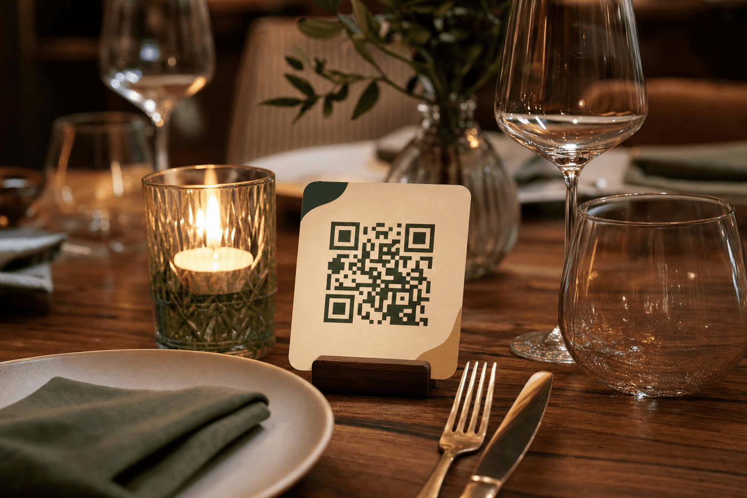
Physical Materials and Placement
A beautifully designed QR code printed on cheap paper undermines the whole effort. The physical carrier is part of the brand experience.
Material options by restaurant type
- Matte card stock (350–400 gsm): The standard for most restaurants. Clean, professional, doesn't produce glare under overhead lighting. Good for table tents and stand-alone cards.
- Laminated cards: Durable and easy to wipe down—practical for high-volume casual dining. Just be aware that high-gloss laminate can create glare that makes scanning harder; matte laminate is safer.
- Acrylic stands: Upscale and durable. A frosted acrylic stand with your logo and a QR code looks premium on a fine-dining table. Higher upfront cost but essentially permanent.
- Engraved wood or metal: Works beautifully for rustic or industrial concepts. Laser-engraved QR codes on wood or brushed metal are distinctive and nearly impossible to damage.
- Stickers on existing items: If you're placing QR codes on existing menus, table surfaces, or condiment holders, use high-quality vinyl stickers with UV coating to prevent fading.
Placement affects scan rates significantly. The code should be at natural eye level when a guest is seated, not tucked under a napkin holder or facing away from the entrance. For a full breakdown of where to position codes in your space, the article on digital menu setup covers placement strategy in depth.
Sizing Your QR Code Correctly
QR codes have a minimum practical size. Below a certain threshold, the modules become too small for phone cameras to resolve quickly, especially in low light. As a general rule:
- Minimum size for table use: 3 cm × 3 cm (roughly 1.2 inches square). This is the absolute floor.
- Recommended size for table cards and tents: 4–6 cm × 4–6 cm. Comfortable to scan without requiring the guest to hold their phone unnaturally close.
- For wall-mounted or entrance displays: Scale up proportionally. A code meant to be scanned from 50 cm away should be at least 8–10 cm square.
When exporting your QR code for print, always request an SVG or high-resolution PNG (at least 1,000 × 1,000 pixels). Scaling up a low-resolution raster image produces blurry modules that fail to scan reliably.
Test Before You Print
This step is skipped constantly and it causes real problems. Before you order 200 table cards, do the following:
- Print a single test copy at the exact final size on the intended material.
- Test it with at least three different phones—mix iPhone and Android models, and include an older device if possible.
- Test in the actual lighting conditions of your dining room, including your dimmest setting for evening service.
- Test from the distance and angle a seated guest would naturally hold their phone.
- Confirm the landing page (your digital menu) loads quickly and displays correctly on mobile.
If any test fails, adjust the design—typically by increasing contrast or enlarging the code—before printing at scale.
Keeping Your Design Consistent Across Touchpoints
Your branded QR code shouldn't live only on the table. Once you have a design you're happy with, apply it consistently:
- Window stickers: Place a QR code in your front window so passersby can browse your menu before deciding to come in.
- Receipts and takeout packaging: A small QR code on a receipt or bag insert encourages repeat visits and online ordering.
- Google Business Profile: You can link your digital menu directly to your profile, extending the reach of your branded menu experience beyond your physical space.
- Social media: Share your QR code on Instagram stories and posts as a direct link to your menu or ordering page.
Consistency across these touchpoints reinforces brand recognition and makes your digital menu feel like a deliberate, professional system rather than a pandemic-era workaround that never got updated.
Frequently Asked Questions
Can I use a colored QR code without hurting scan rates?
Yes, as long as you maintain strong contrast between the modules (foreground) and the background. Dark modules on a light background is the reliable formula. Avoid light-on-dark combinations and always test on real devices in your actual lighting conditions before printing.
How large does the logo in the center of my QR code need to be?
Keep it to no more than 20–25% of the total QR code area. Larger than that and you risk covering too many data modules, causing scan failures even with high error correction. A simple icon or monogram works better than a full wordmark at this size.
Do I need to reprint my QR codes every time I update my menu?
Not if you're using a dynamic QR code. Dynamic codes point to a URL that you control, so you can update the menu behind the link without changing the code itself. This is one of the most practical advantages of a platform like MenuHoster—your printed code stays current indefinitely. Learn more about how this works in our guide to the QR code menu generator.
What file format should I use when exporting my QR code for print?
Always use SVG for print if your generator supports it—it's resolution-independent and will look sharp at any size. If SVG isn't available, export a PNG at a minimum of 1,000 × 1,000 pixels (ideally 2,000+). Never scale up a low-resolution JPEG; the compression artifacts will make modules blurry and unreliable.
Should every table have the same QR code, or should I use unique codes per table?
For most restaurants, one shared code per menu type (e.g., dine-in, bar, patio) is sufficient and much easier to manage. If you want to track which tables get the most scans or enable table-specific ordering, unique per-table codes are useful—but they add complexity to your print and management workflow. Start simple and add granularity only if you have a clear use case for the data.
Ready to build a QR code menu that actually looks like your restaurant? MenuHoster's QR code menu generator lets you customize colors, add your logo, and publish a mobile-optimized menu in minutes—no design experience required. See our pricing and get started today.
MenuHoster Team
Helping restaurants go digital