QR Menu Accessibility: Making Contactless Menus Work for Everyone
Updated:
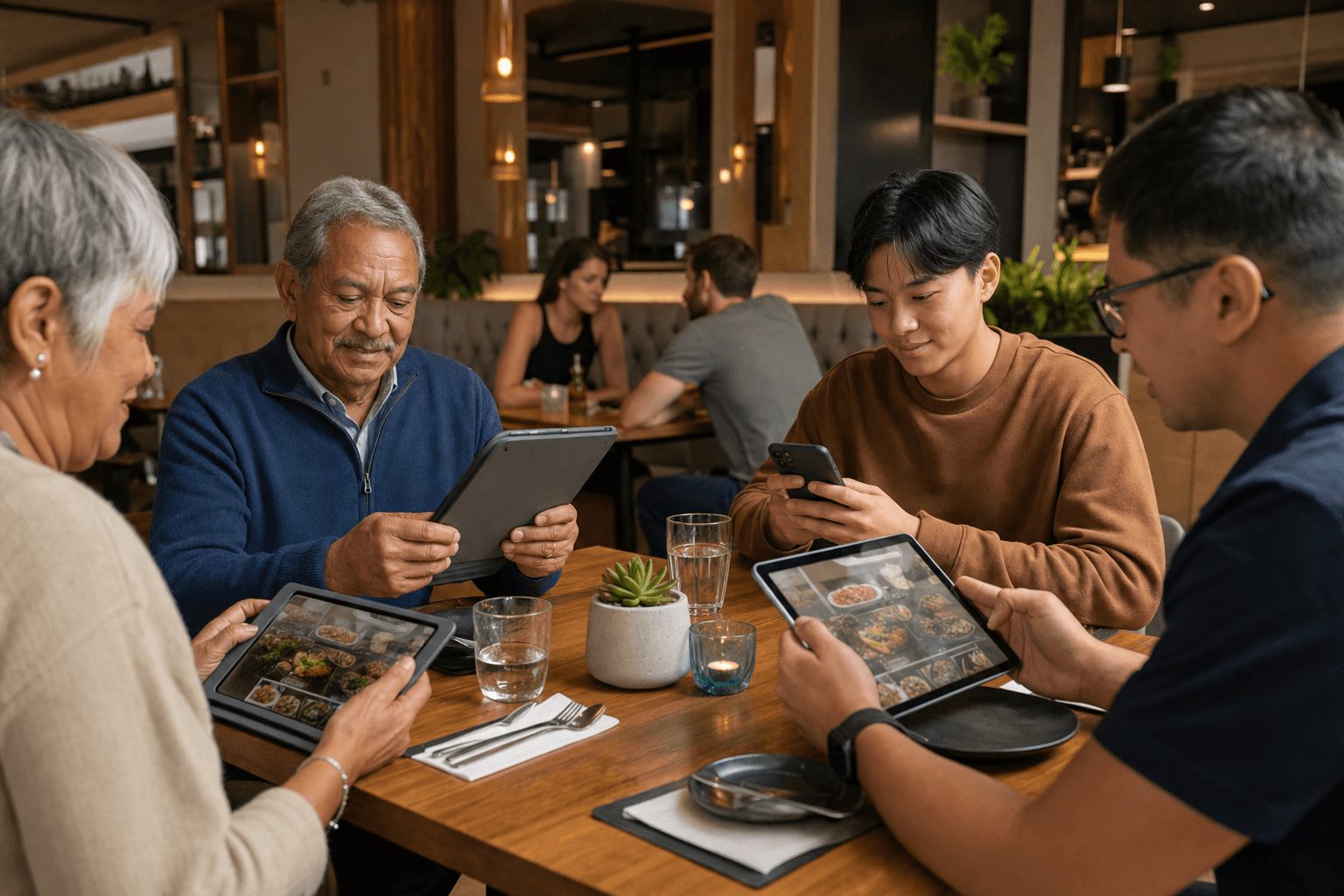
QR code menus have become a fixture in restaurants, cafes, and bars. They cut printing costs, make updates instant, and keep surfaces cleaner. But there's a real problem that many operators overlook: a significant portion of your guests may struggle to use them. Older diners, people with visual impairments, guests with motor difficulties, and anyone without a smartphone can all hit a wall when a QR code is their only option.
Accessibility isn't just a legal consideration—it's a hospitality one. A guest who can't read your menu is a guest who feels excluded, and that sticks. This guide walks through the practical steps to make your contactless menu genuinely usable for every customer who walks through your door.
Why Accessibility Matters for QR Menus
Before diving into fixes, it helps to understand the scale of the issue. According to the CDC, roughly 26% of U.S. adults live with some form of disability. The National Federation of the Blind estimates there are about 7 million Americans with visual impairments. And Pew Research consistently finds that adults over 65 are significantly less likely to own smartphones or feel comfortable using them.
That's not a niche audience—it's a substantial slice of your customer base. If your entire menu experience depends on a guest scanning a QR code with a personal smartphone, you're creating friction for a lot of people. The good news is that most accessibility improvements are straightforward and cost very little to implement.
The Most Common Accessibility Barriers in QR Menus
Understanding where guests get stuck helps you prioritize fixes. Here are the barriers that come up most often:
- No smartphone or data plan: Some guests—particularly older adults and lower-income diners—simply don't have a device capable of scanning a QR code, or don't have mobile data enabled.
- Poor QR code placement or lighting: A code printed on dark paper, placed at the edge of a dim table, or laminated with a glare-producing finish is hard for anyone to scan—and nearly impossible for someone with low vision.
- Text that's too small on mobile: Many digital menus are designed on a desktop and display poorly on a phone screen. Small fonts, tight spacing, and low contrast make reading difficult for guests with visual impairments or age-related vision changes.
- No screen reader support: Menus built as images or PDFs are invisible to screen readers. A guest using VoiceOver or TalkBack will hear nothing useful.
- No fallback option: Restaurants that remove printed menus entirely leave guests with no alternative when the digital experience fails them.
- Complex navigation: Multi-level dropdowns, tiny tap targets, and auto-playing media can be nearly impossible to use for guests with motor impairments or tremors.
Design Your Digital Menu for Readability
The single highest-impact thing you can do is ensure your menu is easy to read on a small screen. This is where most QR menus fall short, and it affects far more than just guests with disabilities.
Use sufficient font size and contrast
The Web Content Accessibility Guidelines (WCAG) recommend a minimum contrast ratio of 4.5:1 for normal text. In practical terms: dark gray or black text on a white or light background. Avoid light gray text on white—it looks elegant in a design mockup and is miserable to read in a restaurant with overhead lighting. Body text should be at least 16px on mobile. Item names and prices should be larger.
Keep layouts clean and linear
Resist the urge to get clever with multi-column grids, overlapping text on images, or decorative fonts for body copy. A single-column layout with clear visual hierarchy—category heading, item name, description, price—is faster to scan and far easier for assistive technology to interpret. When you build your digital menu, prioritize structure over style.
Make tap targets large enough
The WCAG recommends interactive elements be at least 44x44 pixels. A tiny "expand" arrow next to a menu item is going to frustrate anyone with reduced dexterity. If you use expandable sections or category tabs, make sure the clickable area is generous.
Avoid PDFs as your primary menu format
PDF menus are a common shortcut—restaurants scan a printed menu and link to it. The problem is that PDFs are largely inaccessible: they don't reflow for small screens, they require pinching and zooming, and they're often completely unreadable by screen readers unless specifically tagged (almost none are). If you're currently using a PDF, consider converting your PDF menu into a proper digital menu that renders as structured HTML.
Support Screen Readers and Assistive Technology
Guests who are blind or have severe visual impairments use screen readers like Apple's VoiceOver or Android's TalkBack to navigate their phones. For these guests, a QR menu can be either fully functional or completely useless depending on how it's built.
Use real text, not images of text
If your menu is built as a series of images—photos of a printed menu, styled text saved as graphics—a screen reader has nothing to read. Every menu item, description, price, and category should exist as actual text in the page's HTML.
Add alt text to food images
If you include photos of dishes (which can boost order rates significantly), add descriptive alt text to each image. "Grilled salmon with roasted asparagus and lemon butter sauce" is far more useful than "salmon.jpg." This helps screen reader users understand what's on offer and also benefits SEO. For more on how to handle menu labels and descriptions, see our guide on adding allergen and dietary labels the right way.
Ensure logical reading order
Screen readers follow the DOM order of a page—the sequence in which elements appear in the underlying code. If your visual layout uses CSS tricks that reorder content visually without changing the code order, a screen reader may announce items in a confusing sequence. Test your menu with a screen reader at least once to catch these issues.
Avoid auto-playing video or audio
Some restaurants add ambient video or sound to their digital menus for atmosphere. This can be deeply disorienting for screen reader users and guests with cognitive disabilities. If you want visual interest, use static images or allow guests to opt into any media.
Solve the No-Smartphone Problem
A QR code is only as useful as the device scanning it. For guests who don't have a compatible device—or who simply aren't comfortable using one—you need an alternative path.
Keep a small supply of printed menus
This is the simplest and most effective fallback. You don't need to print hundreds of copies. A handful of laminated menus kept behind the host stand costs almost nothing and solves the problem immediately. Train your staff to offer one proactively to any guest who seems to be struggling, rather than waiting to be asked.
Offer a table QR code that links to a URL guests can type
Some guests have smartphones but aren't familiar with the QR scanning process. Consider adding a short, memorable URL beneath the QR code on your table tent—something like "yourvenue.com/menu"—so guests can type it directly into their browser. Most QR menu platforms, including MenuHoster's QR code menu generator, give you a shareable link alongside the code itself.
Use staff as a bridge
Servers and hosts are your most flexible accessibility tool. Brief your team to read menu items aloud when asked, describe daily specials, and assist guests who need help navigating a digital menu. This isn't a workaround—it's good hospitality. The technology should support your service, not replace the human element.
Physical Placement and the QR Code Itself
Accessibility starts before a guest even opens the menu. The physical QR code needs to be scannable in real-world conditions.
- Size matters: A QR code smaller than 1.5 inches square is hard to scan reliably, especially for older cameras or guests holding phones at arm's length. Aim for at least 2 inches square on table tents.
- Contrast is critical: Black code on white background is the gold standard. Avoid printing codes on patterned backgrounds, dark paper, or with decorative colors that reduce contrast.
- Avoid glare: Laminated or glossy surfaces can reflect overhead lighting directly into a camera lens. Matte lamination or uncoated card stock scans more reliably.
- Place codes at a consistent, reachable position: A QR code at the center of a large table may be out of comfortable reach for a guest using a wheelchair or someone with limited arm mobility. Consider placing codes at the edge of the table or on a stand that can be moved.
- Label the code clearly: Include a short instruction like "Scan to view our menu" above the code. Don't assume guests know what to do.
Cognitive Accessibility: Keeping It Simple
Cognitive accessibility is less often discussed but equally important. Guests with cognitive disabilities, dementia, anxiety, or simply information overload benefit from menus that are organized clearly and don't require effort to decode.
Use plain language in descriptions
Avoid overly flowery or jargon-heavy descriptions. "Pan-seared chicken thigh with a white wine and caper reduction, finished with microgreens" communicates more clearly than "Poulet rôti en croûte with artisanal accoutrements." Plain language benefits every guest, not just those with cognitive disabilities.
Organize categories logically
Group items in a predictable order—starters, mains, sides, desserts, drinks—and don't bury important information like allergens or pricing. A guest with anxiety or sensory sensitivities may need to scan the menu quickly to identify safe options. Clear structure makes that possible.
Don't overload the menu
A menu with 80 items across 12 categories is cognitively exhausting for anyone. Trimming your menu to a focused, well-organized list improves the experience for every guest and often increases average order value. This is a case where accessibility and profitability point in the same direction.
Testing Your Menu for Accessibility
You don't need to hire a specialist to do a basic accessibility audit. Here are practical ways to test your own menu:
- Enable VoiceOver (iOS) or TalkBack (Android) on your phone and navigate your menu using only the screen reader. Can you find all the items? Are categories announced clearly? Is the price readable?
- Zoom to 200% in your mobile browser. Does the layout break? Does text overlap or get cut off?
- Check contrast using a free tool like the WebAIM Contrast Checker. Paste in your text and background colors to see if they meet WCAG AA standards.
- Ask a non-tech-savvy friend or family member to scan and use your menu without any guidance. Watch where they get stuck.
- Try scanning the QR code in dim lighting—the kind of lighting your restaurant actually uses in the evening. If it's a struggle, your guests are struggling too.
Legal Considerations
In the United States, the Americans with Disabilities Act (ADA) applies to places of public accommodation, which includes restaurants. While the ADA doesn't prescribe specific technical standards for digital menus, courts and the Department of Justice have increasingly interpreted ADA obligations to extend to digital properties. Several restaurant chains have faced litigation over inaccessible websites and digital ordering systems.
The practical takeaway: making your menu accessible isn't just good hospitality—it reduces legal exposure. Following WCAG 2.1 AA guidelines is the most widely recognized benchmark, and building to that standard is a reasonable, defensible approach.
Frequently Asked Questions
Do I have to remove printed menus entirely if I switch to QR codes?
No—and for accessibility reasons, you shouldn't. Keeping a small number of printed or laminated menus as a fallback is a simple, low-cost way to serve guests who can't or don't want to use a digital menu. Think of printed menus as a backup, not a relic.
Are PDF menus accessible to screen readers?
Generally, no. Most PDFs generated from scanned images or design software are not tagged for accessibility and are unreadable by screen readers. They also don't reflow for small screens. Converting your PDF to a structured digital menu is strongly recommended for accessibility and usability.
What's the easiest way to make my QR menu screen reader friendly?
The most important step is ensuring your menu is built with real HTML text—not images of text. Every item name, description, and price should be actual text on the page. Adding descriptive alt text to food images and ensuring a logical reading order will cover the majority of screen reader use cases.
How large should the QR code be on a table tent?
A minimum of 2 inches square (about 5cm) is a practical guideline for reliable scanning in typical restaurant conditions. Larger is better, especially in lower-light environments. Ensure the code has a white quiet zone (border) around it and is printed on a non-glossy surface to minimize scanning failures.
Does accessibility apply to my online ordering page too?
Yes. If you offer online ordering, the same accessibility principles apply: clear text, sufficient contrast, large tap targets, and screen reader compatibility. A guest who can't navigate your ordering page is a lost order and a poor experience. Apply the same standards you'd use for your menu to every digital touchpoint.
Making your QR menu accessible is one of the most practical improvements you can make to your guest experience—and it benefits far more people than you might expect. If you're ready to build a digital menu that's fast, mobile-friendly, and designed to work for every guest, try MenuHoster's QR code menu generator and see how easy it is to get set up in minutes.
MenuHoster Team
Helping restaurants go digital